Everything you do in Pinegrow is live. All the changes you do are immediatelly visible in one or more page views. There you can build and test your page at the same time.
Here’s everything there is to know about page views.
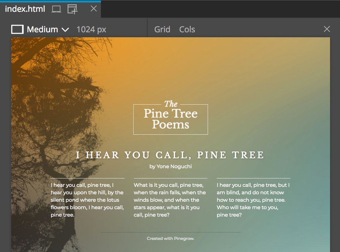
Choosing the size
Users will view your pages on different devices and in at different browser sizes: from large desktop computers, laptops to mobile phones. That’s why you should design your webpages with this flexibility in mind.
Page views can be freely resized so that you can work with your page at different device sizes.
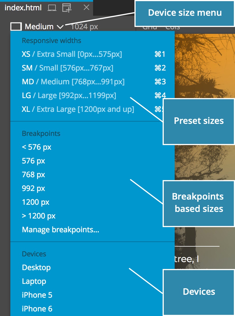
Use Device menu to chose one of predefined sizes.
The menu contains:
- Sizes defined by frameworks, like Bootstrap, or default Pinegrow sizes. Keyboard shortcuts
CMD +
1,
CMD +
2 and so on are associated with them. - Widths set by responsive CSS breakpoint. Pinegrow discovers breakpoints by analysing stylesheets used on the page. “Manage breakpoints” command is also there.
- A set of actuall devices that have both width and height set (the rest of items in this menu only specify the width).
The width and height of the page view can also be set by entering dimensions into the width and height input fields:
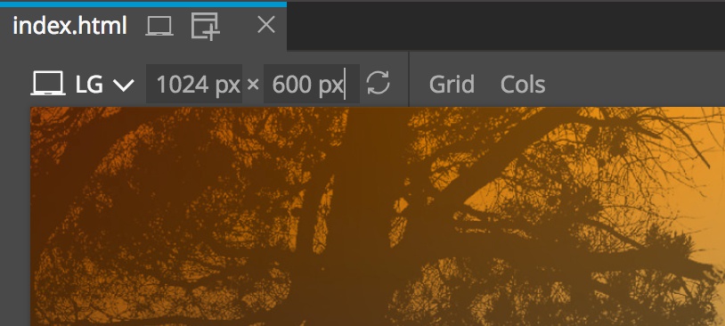
Page views with both width and height can be rotated.
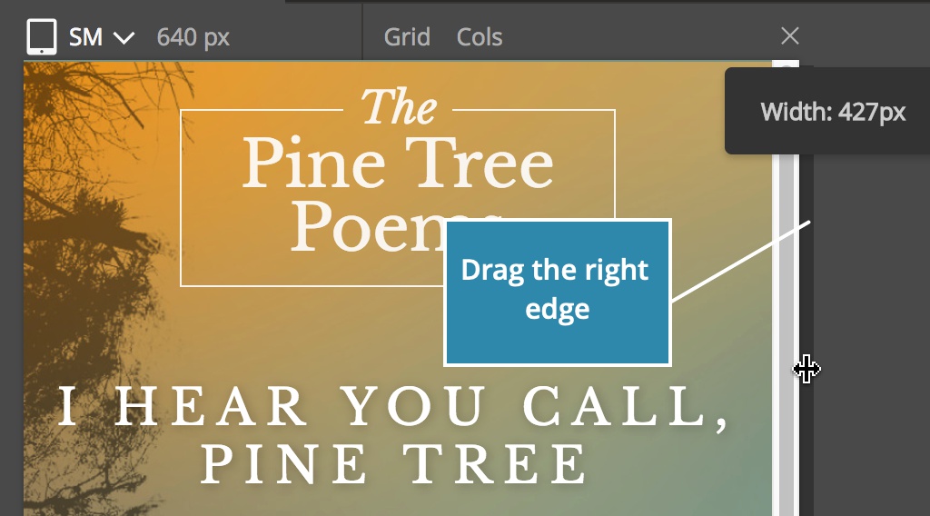
Another way to change the width of the page view is to drag its right edge left or right:
Using multiple page views
Not only can you resize the page view – Pinegrow lets you open multiple views of the same page. All page views are editable and all edits are immediatelly synced between them.
Use in the page tab or in the top toolbar to add a new view:
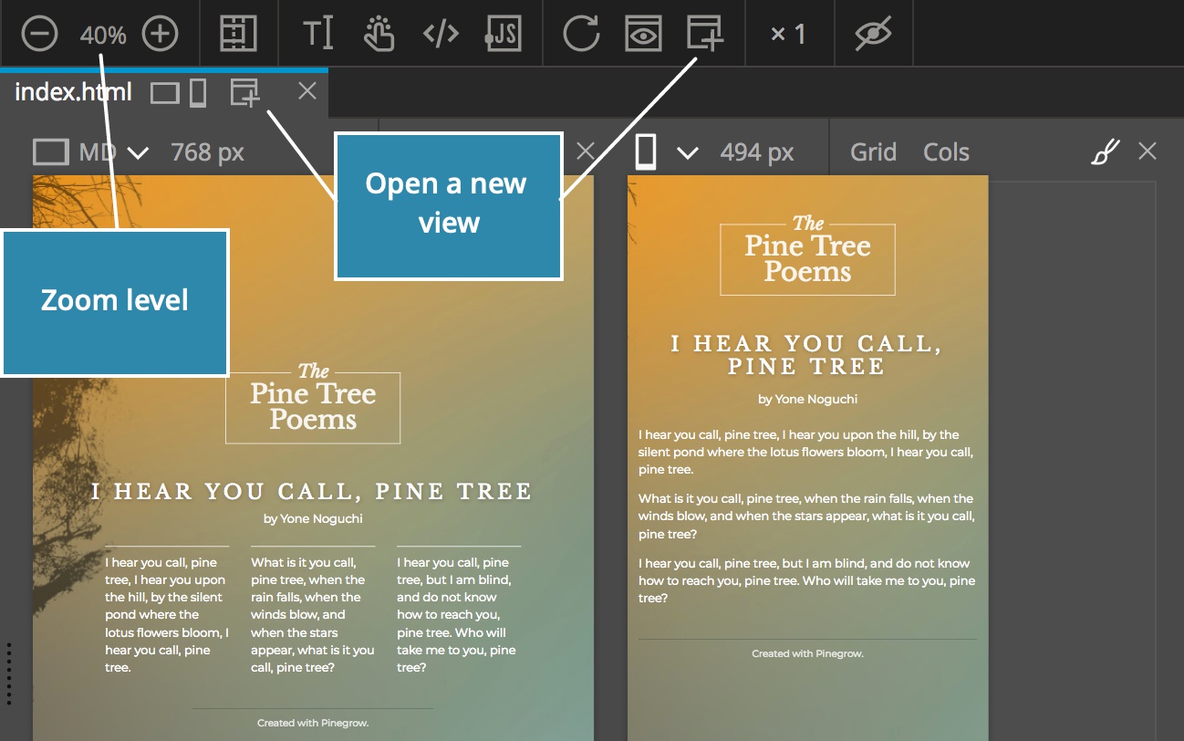
Views are displayed in a row, from left to right.
If the zoom level is set to Fit, views will be resized to fit into the available space. If you use a fixed magnification – 100%, for example – all views might not fit into the space. In that case use the horizontal scrollbar at the bottom to scroll left and right.
Or, click on view icons in the page tab to jump to a page view:
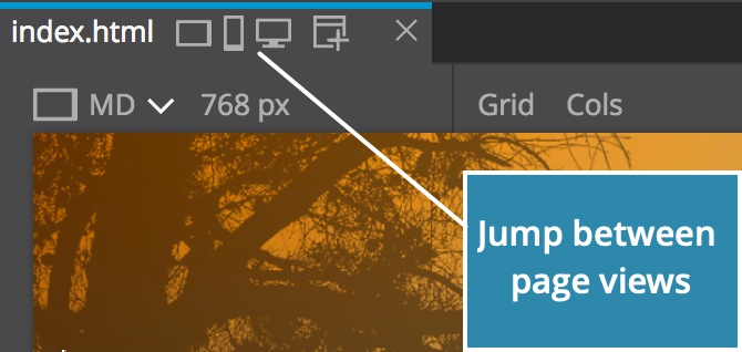
You can select and edit elements on any of the page views. Selected elements will be marked on all page views and all edits synced between them.
NoteHaving too many page views open will impact the app performance. Keep only as many are needed for the task at hand. Closing and reopening page views is easy.
The active page view
In general, it doesn’t matter on which page view you edit the page. But, that’s not the case for CSS editing if you use media queries to target specific devices.
In that case some CSS rules only affect the page when it is displayed at the certaing device size. For example, we might use media query to make the H1 element smaller on mobile devices.
So how does the Style panel decide for which page view to show active CSS rules?
That’s simple when only one page view is open.
When multiple page views are open, the active view is marked by the highlighted style icon:

You can switch the active view by:
- clicking on the
icon above the page view. - Selecting an element on the page view will mark that page view as active.
Closing the page view
Click on the above the page view to close it:
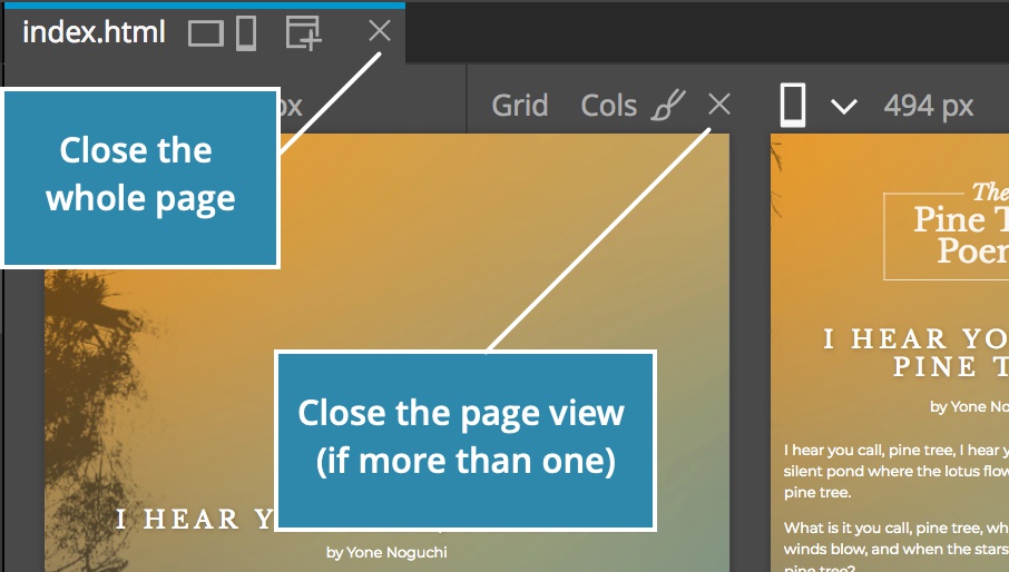
When you close the last page view, the whole page will be closed.
Center page views
By default, page views are positioned on the left side of the page area. So, if the width of page views is less than the width of the page area, the empty space will be shown on the right side. That’s the good place for placing various panels.
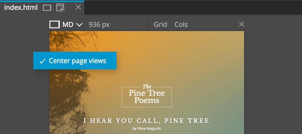
Sometimes it is better to have the page view front and center, for example, when you’re writing content or focusing on an important design consideration.
To center page views in the page area, right-click on the empty space in the page area and choose “Center page views” option from the menu:
Showing multiple pages side by side
Until here we were talking about multiple views of the same page. That’s great, but sometime it is useful to show different pages side by side.
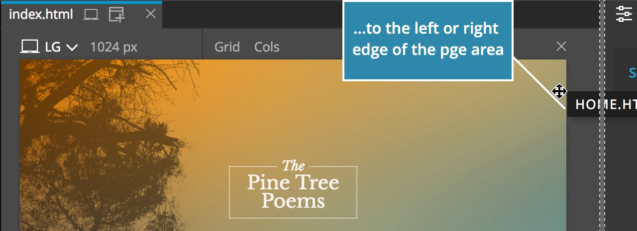
To do that, you can split the page area by holding the page tab and dragging it…

…to the left or to the right side of the existing page area.
This will create two or more page panels. You can freely move page tabs between page panels.
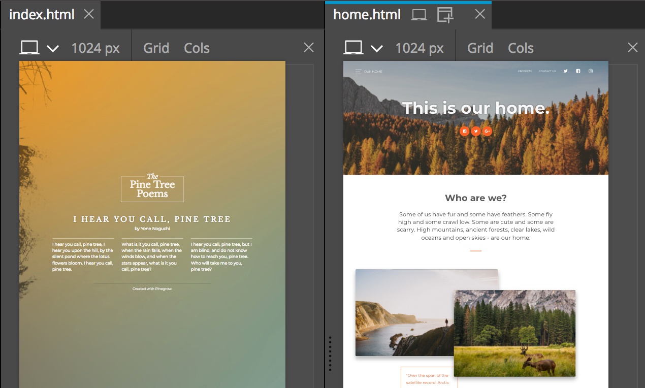
Close an extra page area by closing its pages or by dragging its page tabs to the main page area tab header.