The Floating Tools panel allows you to style your Tailwind CSS page with many of the common classes directly within the Page View, speeding up page construction and design implementation. No more switching between the page and the Properties or Style Panel. Let’s explore just what this tool allows you to do!

The Floating Tools panel is automatically added to any Tailwind CSS project, but there are a couple of ways to get it to display if it is not visible, or you close it.
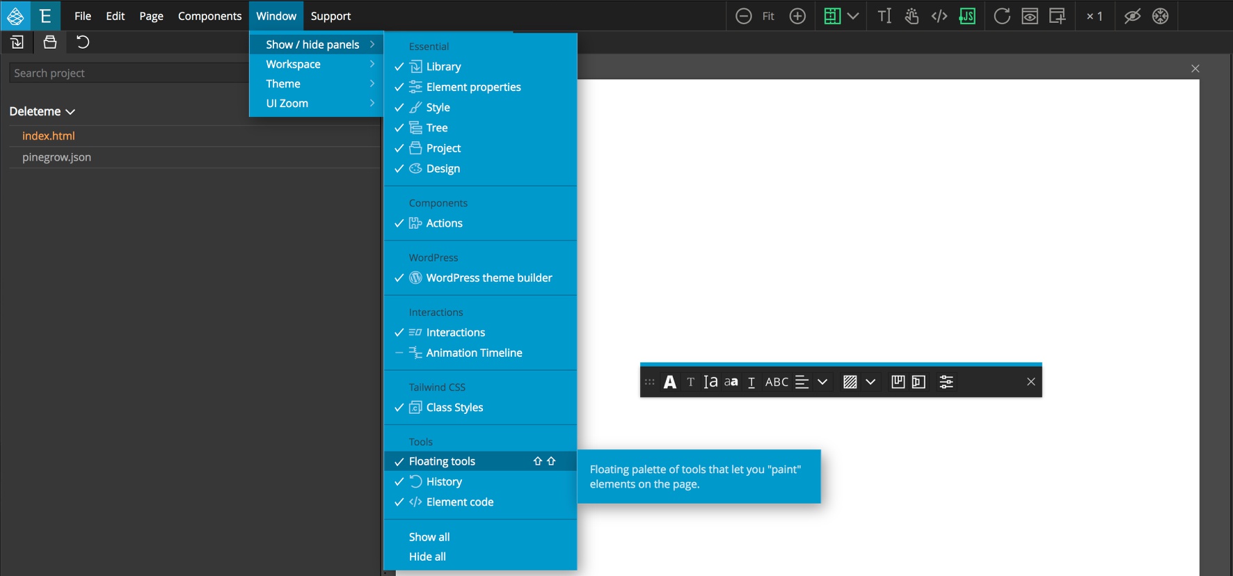
The first is through the “Window” menu “Show/hide panels” drop-down. In the tools category is a selection for the Floating Tools. This also shows the second way to get them to display – using the double <kbd>SHIFT</kbd> hotkey – just tap the shift key twice. This will also cause the Floating tools to “fly” to your current cursor location. The final way to open the Floating tools panel is only available if you have the Design panel activated for your project. At the bottom of the design panel, next to the “Surprise me!” button is a palette icon that will open the tools.
Note: For more information about the Design panel see the documentation here.

The Floating Tools can be used to add styling to your page elements in two different ways. By default, it is in “Set mode”. This means that it will add styling to the currently selected element(s). In “Paint mode” you can first select a tool and then each element you click on the page will have that styling added. Just like with adding styles through the Properties or Style panels, any changes will be reflected immediately if BrowserSync is turned on.
By default, the Floating Tools will be set to add any applied stylings without prefix – the same as having the Properties panel top tab set to “ALL”. Changing the tab to a specific size, for example “LG”, will cause the appropriate prefix to be added to the classes. Similarly, selecting a pseudo class in the Properties panel will add the appropriate prefix – for example, hover:.
The Floating Tools for Tailwind CSS has over 12 categories of Tailwind classes that can be added. Let’s start at the left and examine each.
Text color

The first tool is used to add text color class to any selected or painted element(s) for example .text-red-600. All of the colors and shades from your palette will be available, including custom colors defined through the Design panel if activated. You can also see that the styling already added to the element will be indicated in the Floating Tools if you are in Set mode.
Font
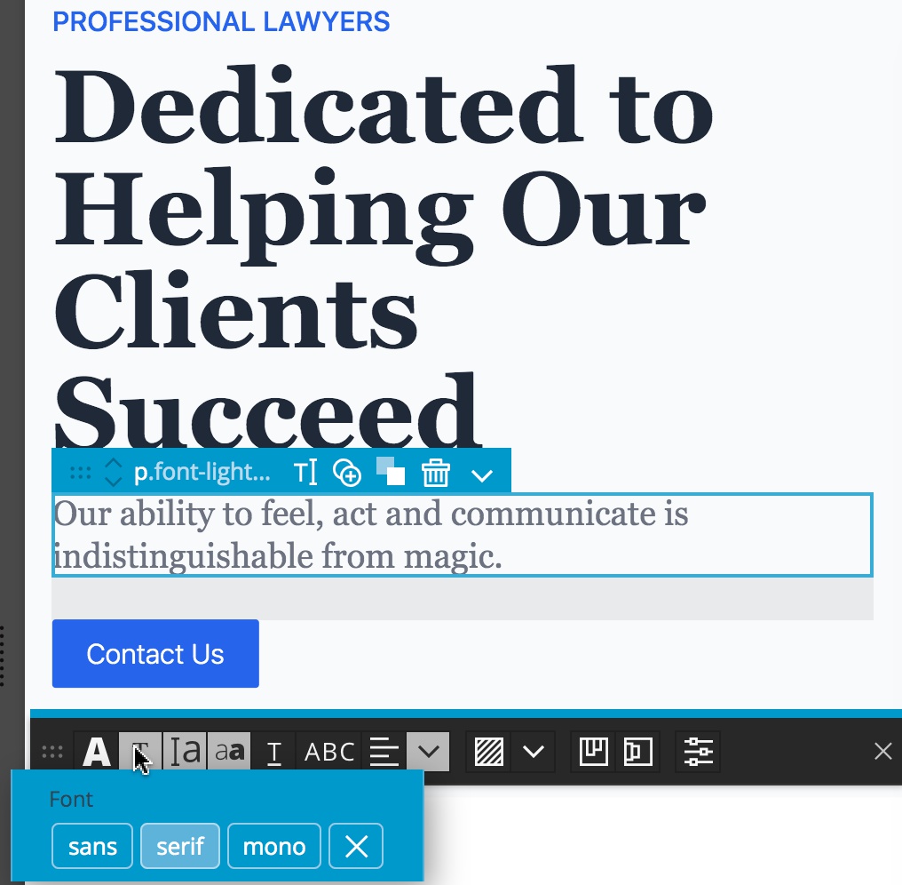
The next tool changes or adds a selected font to the element(s). In this case, we are applying the .font-serif class. Again, custom fonts added in the Design panel will be available. With most of the tools, in order to remove an existing styling class, click on the ‘X’ icon.
Font size
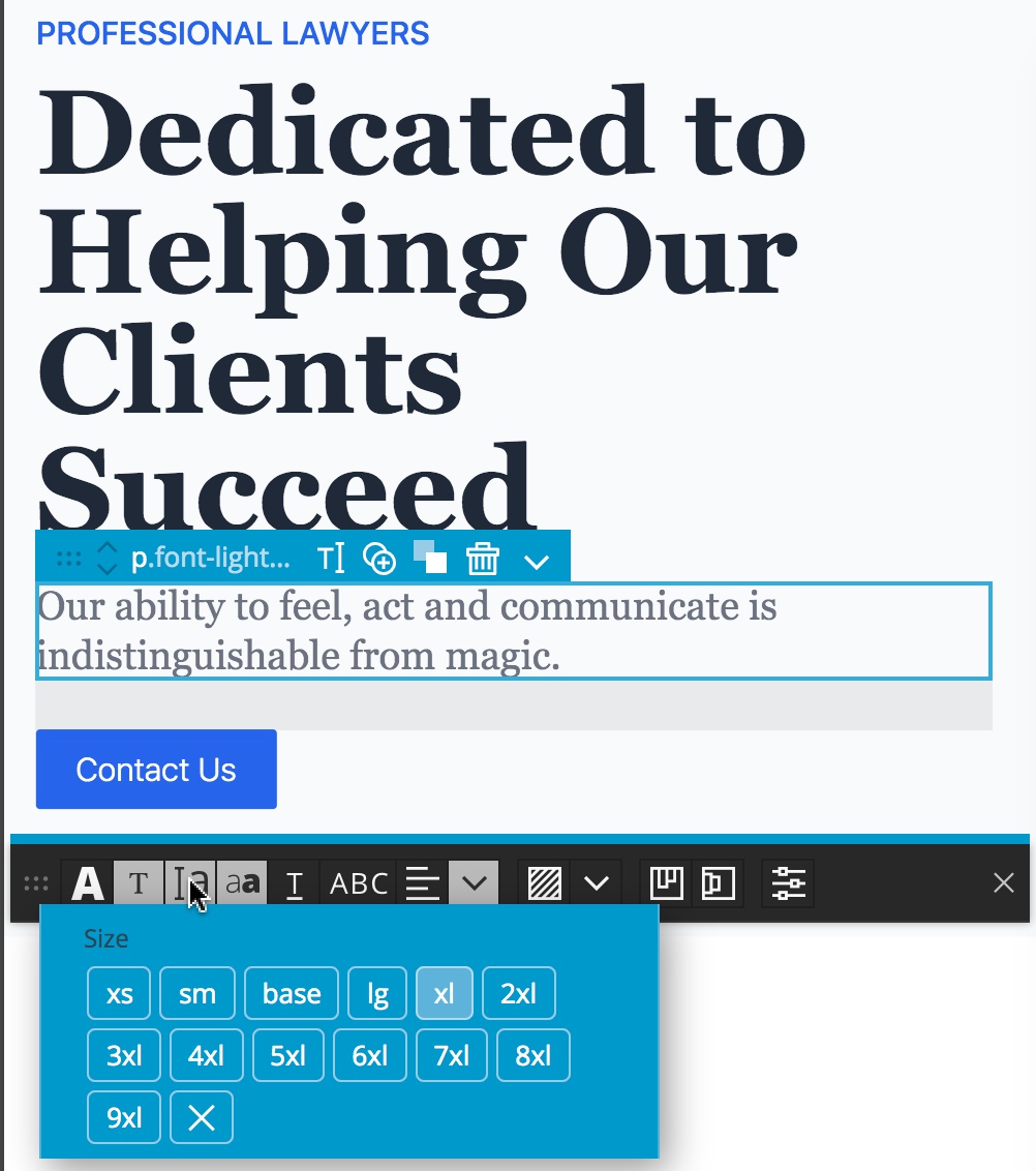
The third icon allows you to change the text size.
Font weight
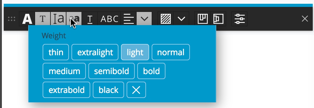
The fourth icon applies one of the available font weights to the selected or painted elements.
Text decoration
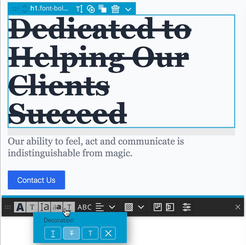
The next icon adds one of three text decoration classes – .underline, .line-through, or .no-underline. The ‘X’ icon removes any styling.
Text transformation

The sixth icon allows you to control the capitalization of a selected element. The four choices are .uppercase, .lowercase, .capitalize, and .normal-case.
Text alignment

There are two more Floating Tools for controlling text. The next icon controls the alignment of the text by adding either .text-left, .text-center, .text-right, or .text-justify classes.
Miscellaneous text styling
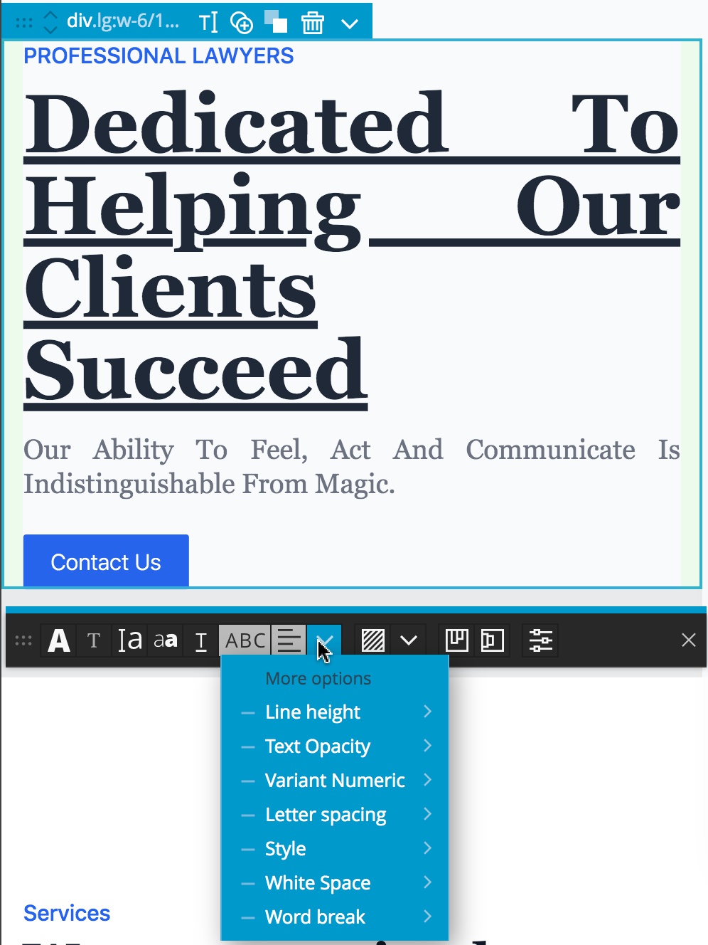
The caret next to the alignment tool opens a drop-down that contains a number of lesser used text styling options, like line height and letter spacing.
Background color
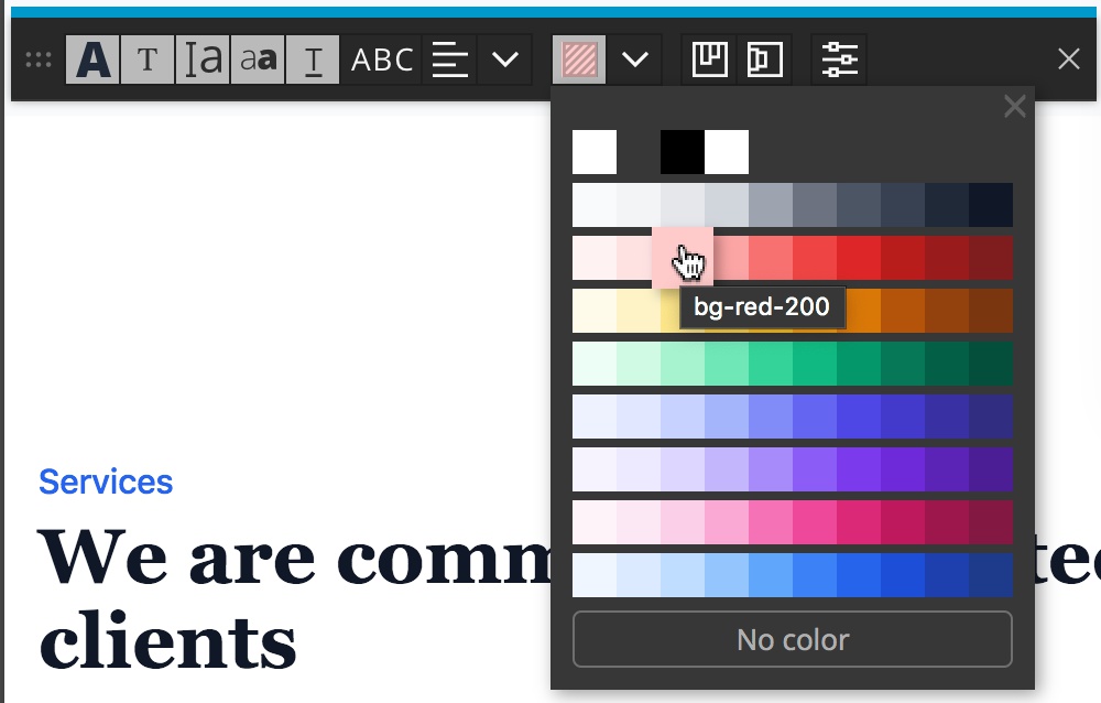
The next icon in the Floating Tools should look familiar from the Styles Panel – it allows you to set the background color of any selected elements by applying the applicable class, like .bg-red-200, for example. Like the font color tool, this tool will display all of your theme colors and shades, including those added through the Design panel.
Miscellaneous background controls
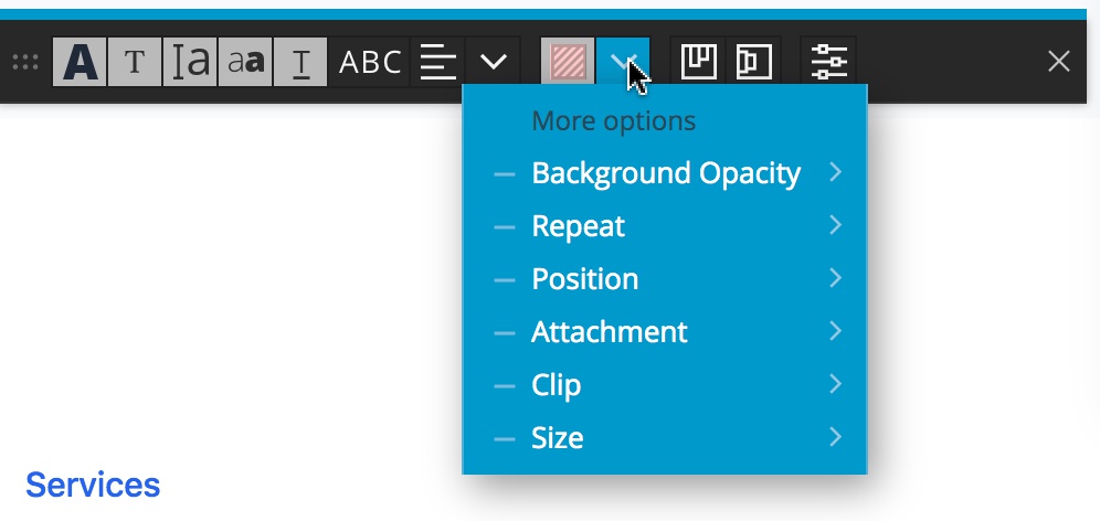
To round out background styling, next to the background color tool is a dropdown for other styling options like position and clip.
Flex controls

The next two tools control the horizontal and vertical flex classes, respectively, and should be used on the container elements, not the individual elements. These are smart tools that along with the specific alignment, will also add either the .flex or .inline-flex classes, as needed.
.justify-start, .justify-center, .justify-end, .justify-between, .justify-around, and .justify-evenly.

The vertical classes are – .items-stretch, .items-start, .items-center, .items-end, and .items-baseline.
Painting inline SVG elements
By default inline SVG elements are collapsed in the Tree panel. That means that SVG subelements can’t be selected on the page. In order to be able to select SVG sub elements, click on an inline SVG within the Tree panel to cause it to expand. You can then select and style paths within the SVG on the page and style them with the Floating Tools. Click again to collapse it.
When Floating tools are used in the Paint mode, you can paint SVG sub elements even if the SVG is collapsed. For both modes, the background color is applied as the text color and fill is set to currentColor. For text, the stroke is set to currentColor.
Note: If you liked this documentation, check out one of our Tailwind CSS tutorials here.