Nuxt provides is an amazing Vue Meta-framework that provides one of the best developer experience both via features and it’s innovative set of toolsets.
Vue Designer supports visual editing of Vue components in all Nuxt apps through the Pinegrow Nuxt Module, which is a wrapper on top of Pinegrow Vite Plugin.
Just follow the instructions in the Config Panel when you open your Nuxt apps in Vue Designer, similar to adding the Pinegrow Vite Plugin in the Vite guide.
The start-screen includes quick-start templates, sample apps such as Happy Paws, and also showcases forks of apps maintained by the Nuxt team, namely the movies and hackernews apps.
These two apps are good examples of how you can simply add the Pinegrow Nuxt Module, and open your project in Vue Designer to live-design your Vue components.
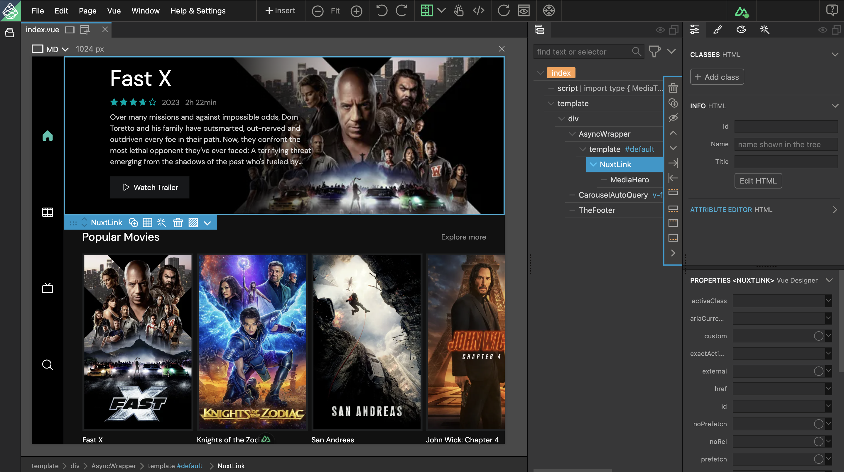
The following are some special Nuxt features in Vue Designer.
Nuxt SFC templates
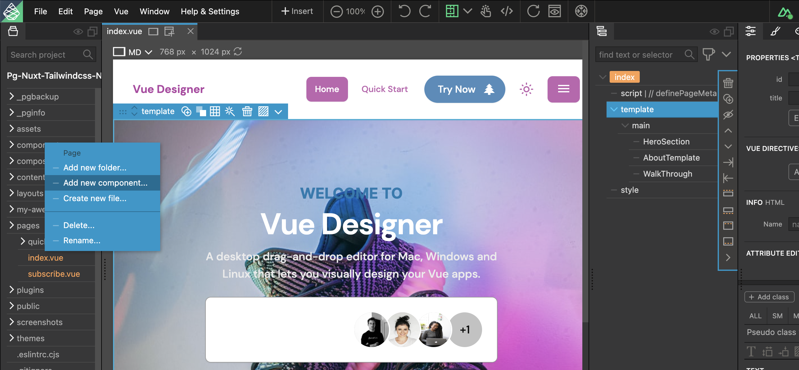
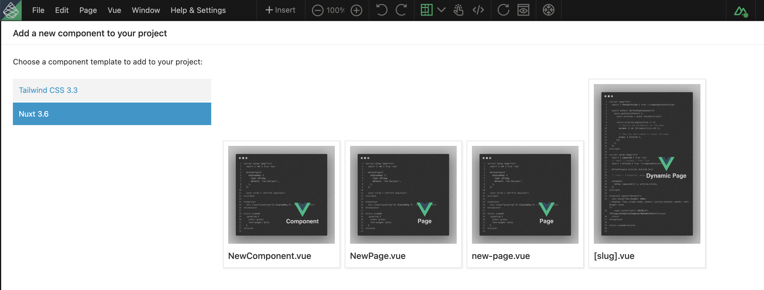
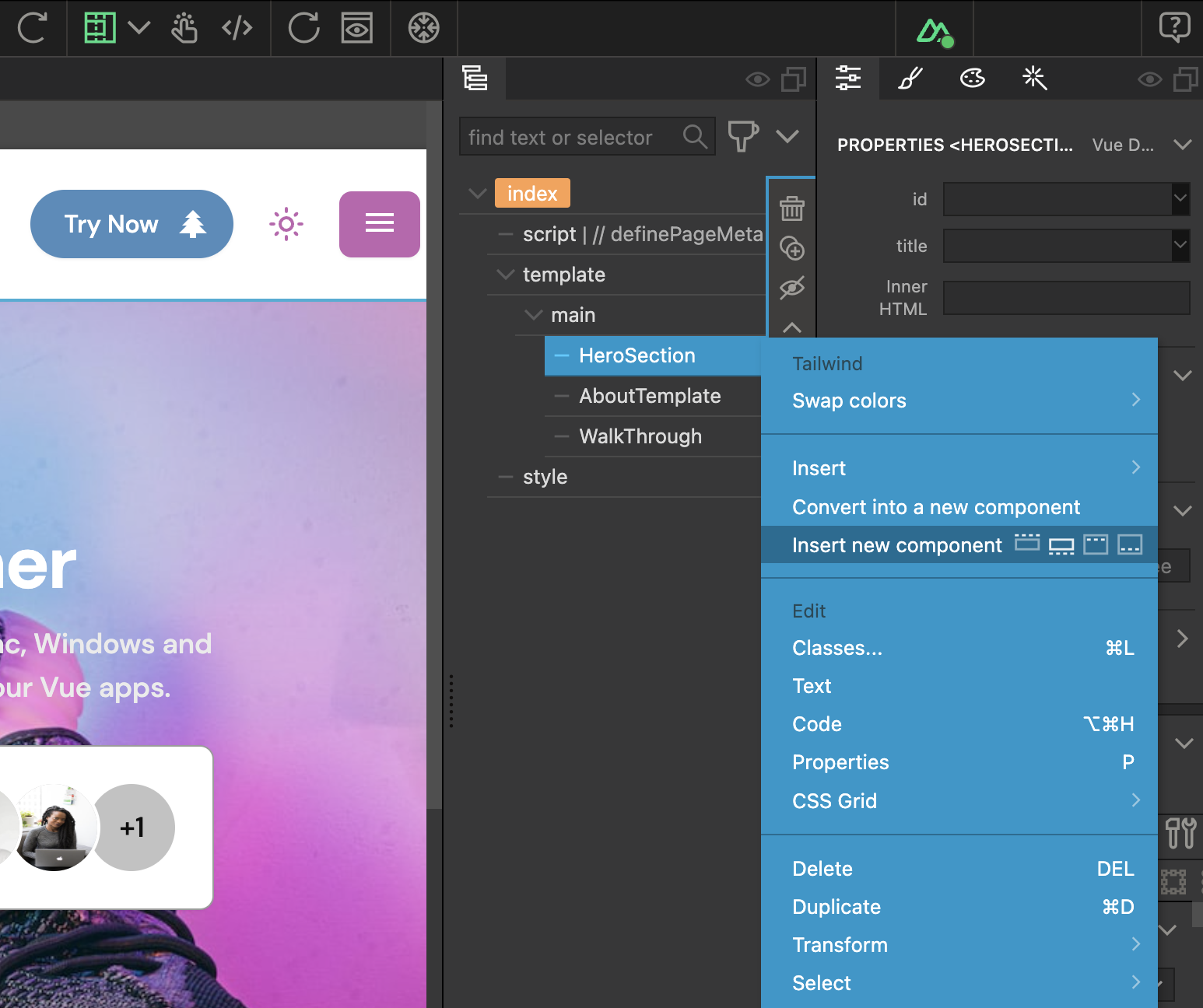
Right-click on your components/pages folder, choose Nuxt in the vertical sidebar, and select the template to add it to your project.
Nuxt Directory conventions
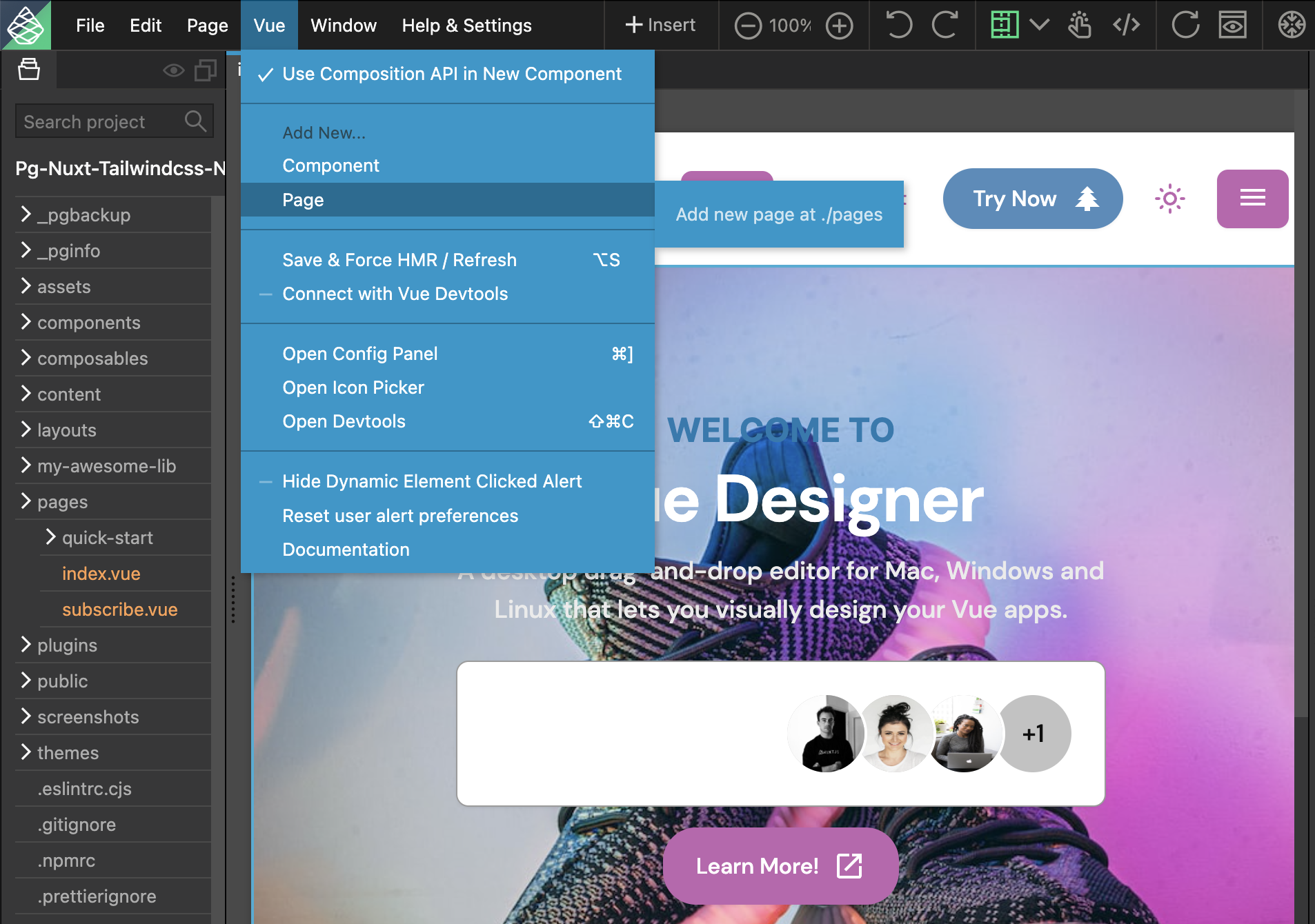
When adding a new component or page from the SFC templates to your project either via the Vue menu or from the current page tree, the vue files are automatically added to the ./components or ./pages folder following the Nuxt convention.
Nuxt Component Libraries
The following component libraries are automatically added and displayed in the Library Panel for easy drag-and-drop.
- Nuxt Components shipped with Nuxt (for eg, NuxtLink) are displayed in the Library Panel for easy drag-and-drop.
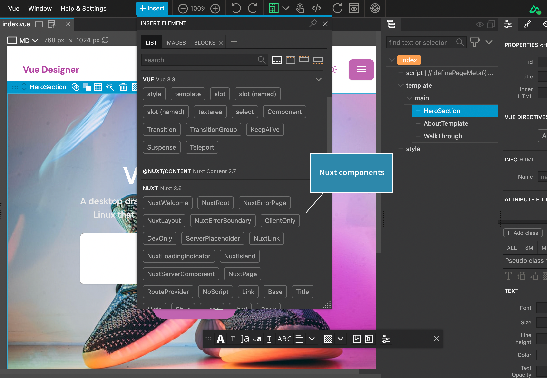
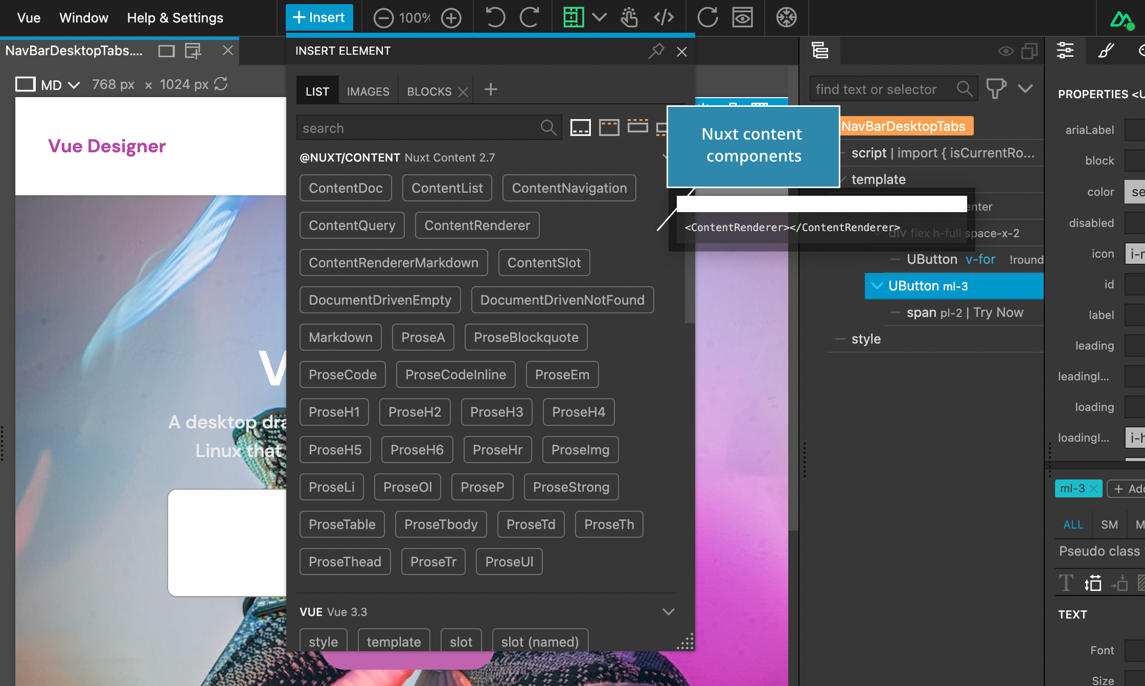
- Nuxt Content components are automatically added and displayed in the Library Panel, if your project has
@nuxt/contentinstalled.
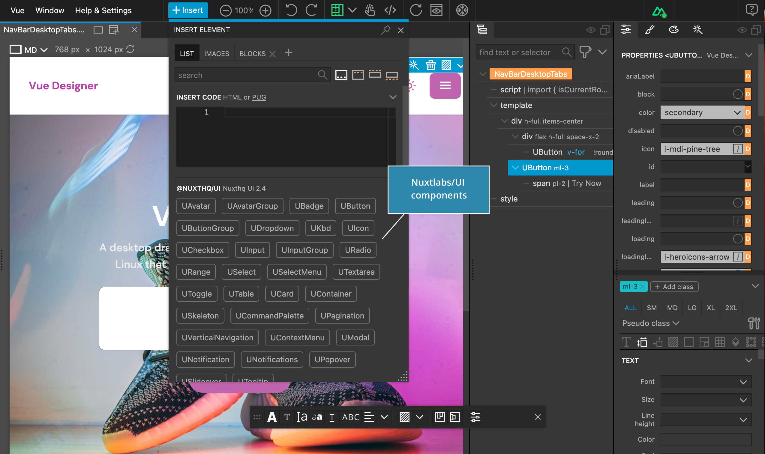
- Nuxtlabs/UI component library is automatically added and displayed in the Library Panel, if your project has
@nuxthq/uiinstalled.
Other Nuxt Packages
Config Panel also displays instructions to add other key packages within the Nuxt ecosystem like Nuxt Icon, Nuxt Devtools etc.,
Refer to Icon Picker and Devtools guides for more details.