The Pinegrow Web Editor makes creating Gutenberg blocks easy! However, some blocks have dynamic content or styling that requires some work-arounds to use as a block. In this tutorial we will explore how to add a JavaScript-powered Bootstrap carousel to our custom theme.
Specialized Blocks

In our past tutorials we have learned how to add blocks with static content, as well as blocks that display posts or other content pulled from the WordPress database. In this tutorial we will look at creating a block that has dynamic styling added by JavaScript. This can be problematic within the editor if this styling hides some content, for example the Bootstrap carousel that hides and reveals slide content. Let’s get started!
Prefer to read? Scroll past the video.
This tutorial is available in video and textual form. Watch the video, or continue reading. Of course, you can also do both!
Creating nested blocks and class toggles
Before starting this tutorial you should already have set-up our theme as outlined in tutorial 1. Optionally, you can also follow the creation of regular and nested blocks from tutorial part 2, 3 and 4.
Creating the main block
- Open the “block.html” page. This was created in our first tutorial.
- Select the Testimonials section – it is the 7th down within the main site content section.
- From the WordPress Actions panel click on the “Block” action.
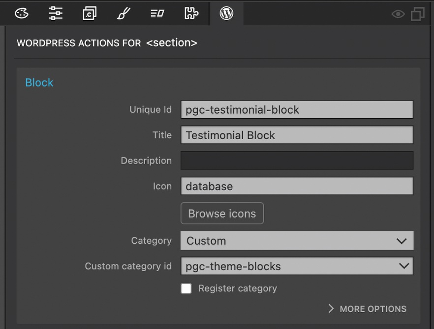
Fill out the block details.
- Add a unique id, I prefer to prefix mine, Title, and select an icon (remember that if you use a dashicon you do not need the ‘dashicon-‘ prefix).
- For ‘Category’ select ‘Custom’ and then choose the already registered id for our blocks from the dropdown.
Adding additional block attributes
Since we have already created a number of blocks in this series of tutorials, I’m only going to add two block attributes and then provide a list of other potential options that you can add as an exercise.
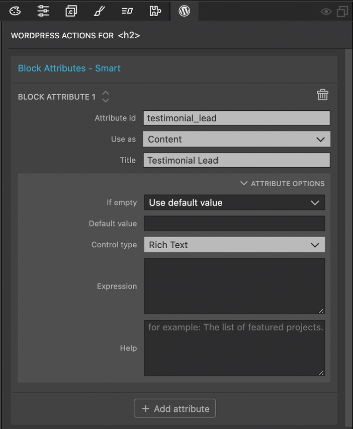
- Select the lead text at the top of the block and click on the “Block attribute” action.
- Add a unique id and title.
- Select “Content” for the “Use as” field.
- In the “Attribute Options” add “Rich Text” for the “Control Type”.
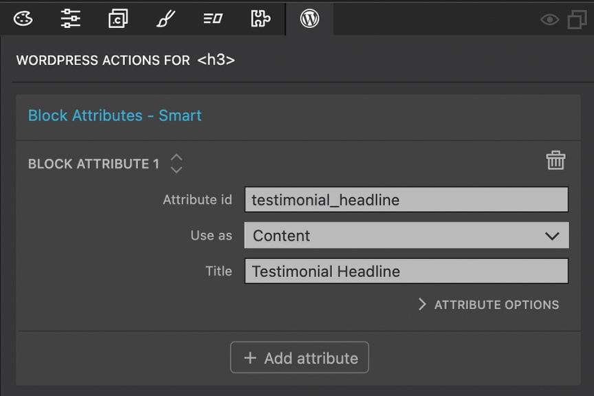
- Select the headline text and click on the “Block attribute” action.
- Add a unique id and title.
- Select “Content” for the “Use as” field.
Controls to change the font size, family, or alignment of the lead and headline text would be useful in our theme. Additionally, adding a control to the main block to control the section background color would allow the user to make the block fit in with other blocks in our theme.
Creating the nested slide block
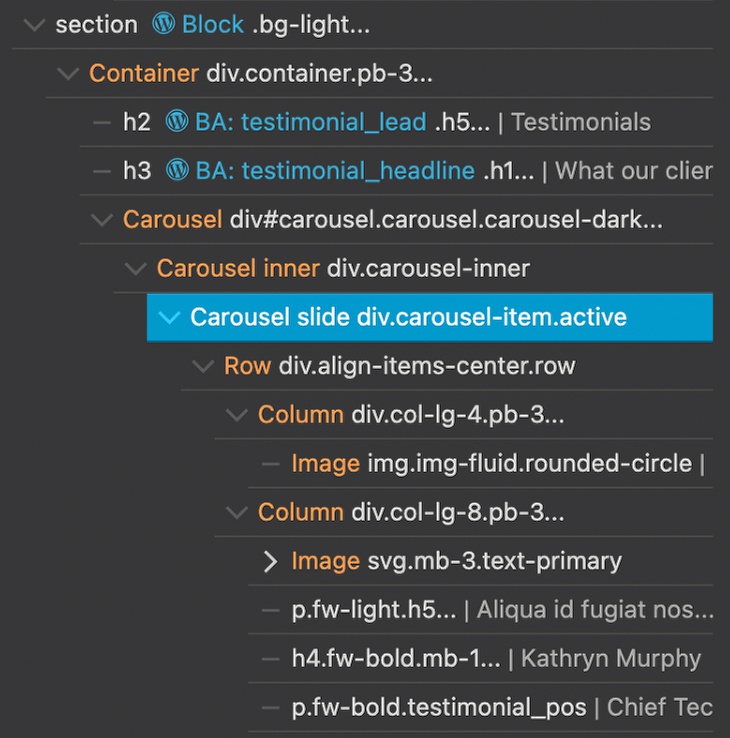
We want our users to be able to add as many or few testimonial slides as desired. This could best be accomplished using a nested block for each slide within the larger testimonial block. Looking at the HTML structure, all of the individual slides are contained within the “Carousel inner” div. This wrapper would make a perfect place to add a ‘Block Inner Content’ action.
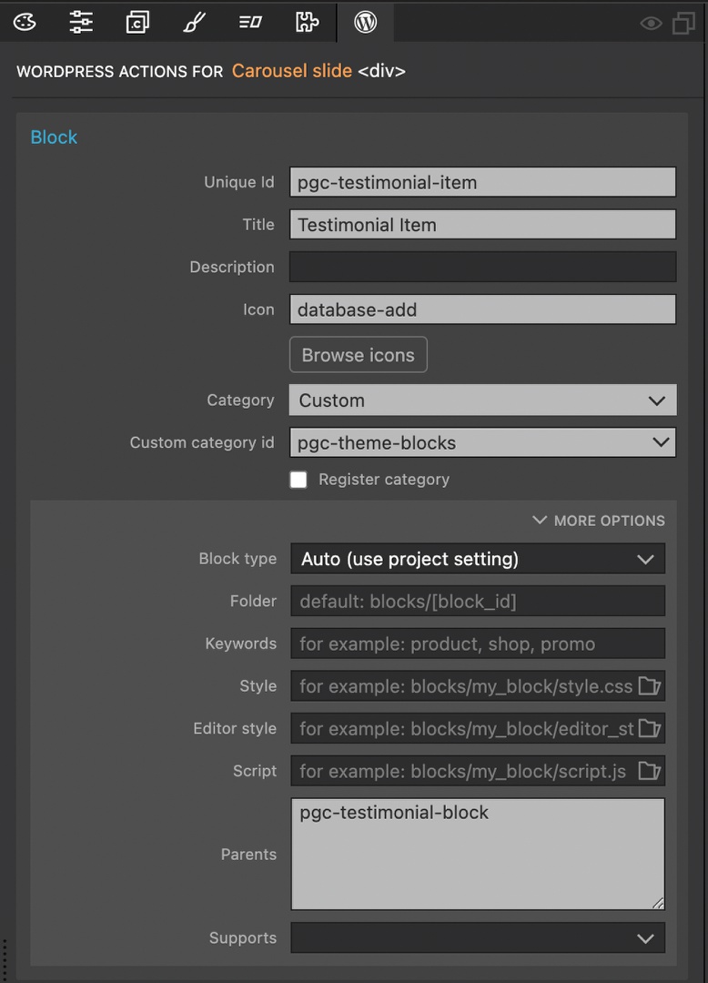
- Select the first carousel slide in the Tree panel.
- Add a “Block” action.
- Give the block a unique id – once again, I prefixed mine. Add a title and icon, plus add the block to our custom category.
- Open the more options and add the unique id of the carousel block,in my example “pgc-testimonial-block”, to the “Parents” input field.
Adding the parent id to the slide block will restrict this block to just the carousel. The end user won’t be able to add slide blocks in areas where they might cause problems with the carousel and not function correctly.
While we could add “Don’t Export” actions to each of the other slide sections, this action is mostly used to keep our design intact. In this case, the other slides aren’t displayed in Pinegrow, so we can just delete these sections without impacting our layout.
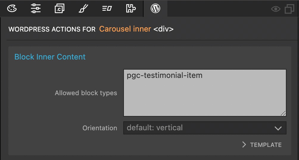
- Select the “Carousel inner” div.
- Add the “block Inner Content” action.
- Add the unique id of your slide block, in this example ‘pgc-testimonial-item’.
Adding Block Attribute controls to the slide
Again, we could add a wealth of controls to our slide section, but I will only add a few since we have done a lot of this previously.
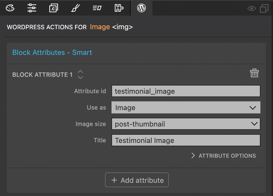
- Select the main slide image located to the left of the testimonial in the Page View or Tree panel.
- Add the “Block Attribute” action.
- Add an attribute id, select “Image” for the “Use as” field, pick an image size, and give a title.

Add block attributes to change the content of the <p> containing the testimonial, the <h4> containing the author’s name, and the <p> containing the author’s position. You can also elect to change the color of any of these using a “Select” control or other aspects of the text, like font-weight using the fw-xxx Bootstrap classes.
Visualizing multiple slides
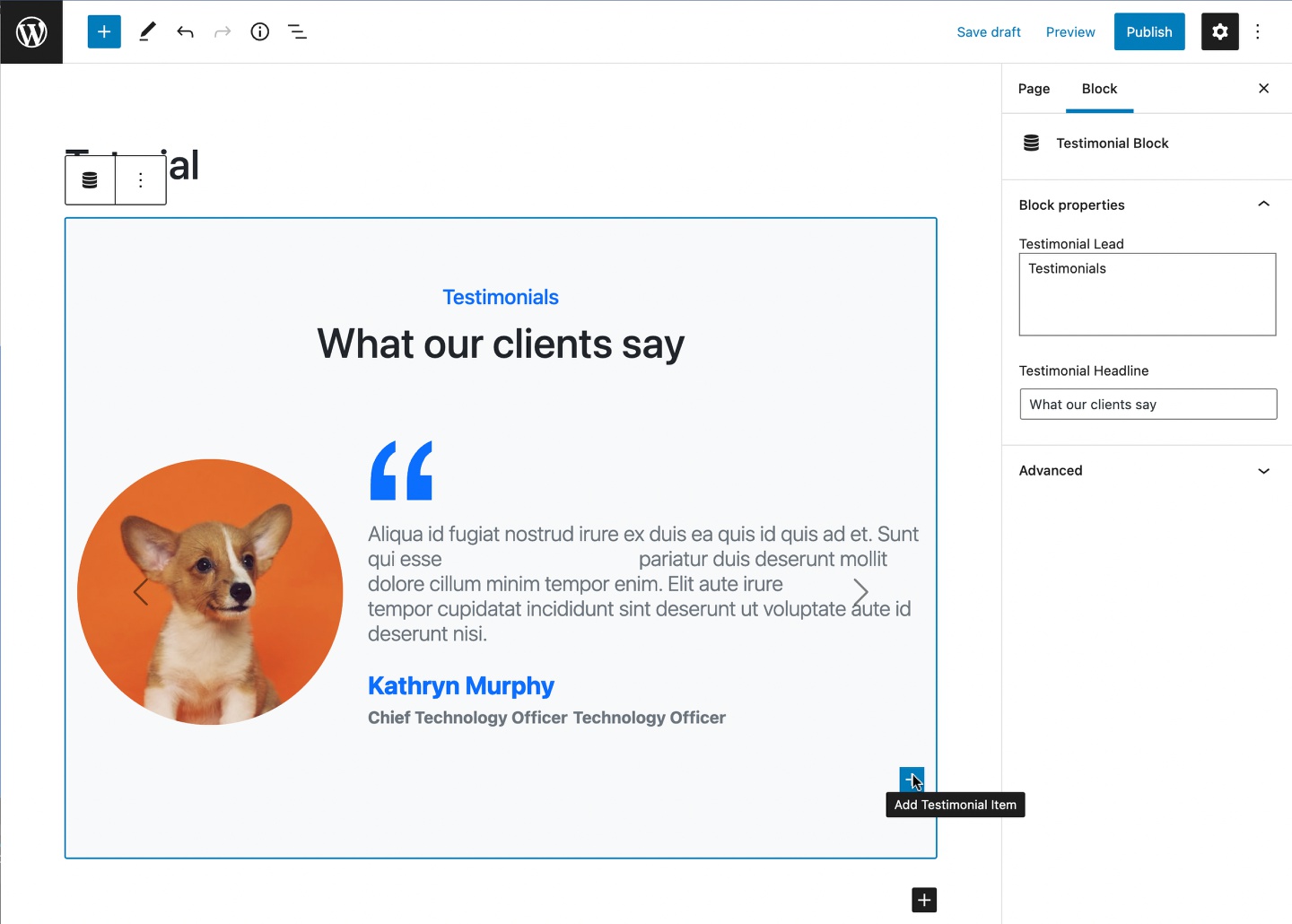
At this point, if we save and export our theme, then create a new page with our testimonial block, we will see a problem if we add an additional slide. Even though we can click the button to add a new testimonial item, it will look like no change has occurred. What is happening?!?

If we change the testimonial image we can see the problem. New slides are being added, but they are stacking on top of each other. At this point we can use the block order control to shuffle the blocks and edit each, but this isn’t the greatest solution.
There is also a second problem that only becomes apparent when we try and view our page on the front-end. All of the testimonials will be displayed at once, just like in the editor. This is because our testimonial item block has a class of ‘active’ added. The Bootstrap JavaScript expects that only one slide in a carousel should have this class.
To fix this we need to add two new controls. One will toggle the styling to show all of the testimonial items on the back end. The other control will allow the user to select which of the testimonial items should be the active one on page load.
Toggling the slides
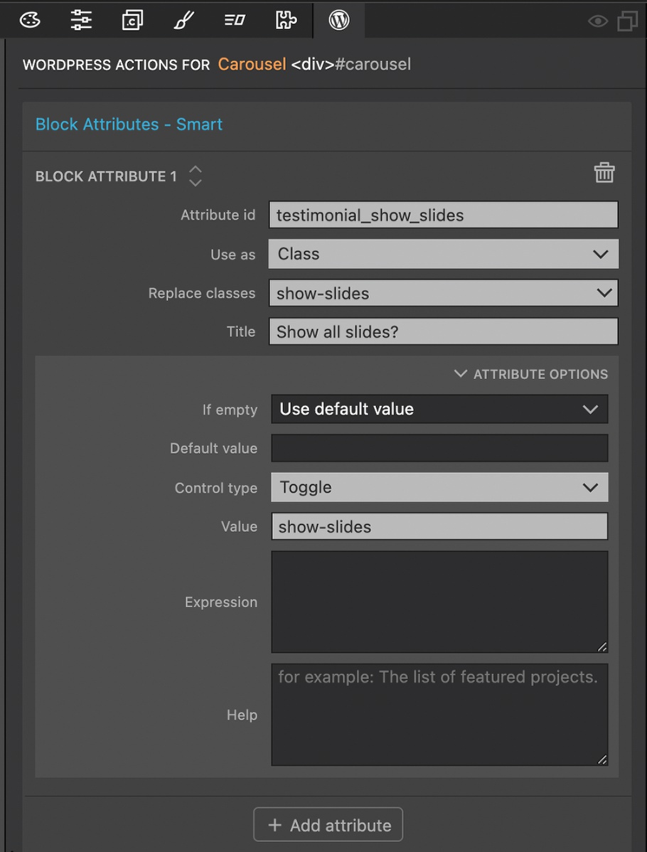
To allow the user to display all of the slides we will use some custom styling in the editor that will be applied by adding a new class, ‘show-slides’, to the carousel.
- Select the “Carousel” div in either the Page View or Tree panel.
- Add a “Block Attribute” action.
- Add an “Attribute id” and select “Class” for the “Use as” field.
- For the “Replace classes” field type in “show-slides” rather than selecting from the drop-down.
- For “Title” I added in a question to be displayed to the user – “Show all slides?”.
- In the “Attribute Options” section select “Toggle” for the “Control type” and add “show-slides” for the value.
Next, we need to attach our custom styling to the main testimonial block so that it is loaded in the editor.
- Create a new file named “testimonial.css” by clicking on the caret next to the project title in the Project panel and selecting “Create new file”.
- Open the file in the built-in code editor by double clicking, or open the file in your favorite external editor.
- Paste the following styling into the file and save.
.carousel.show-slides .carousel-inner {
    overflow: visible !important;
}

.carousel.show-slides .carousel-item {
    display: block !important;
    float: none !important;
    margin-right: 0 !important;
}

.carousel.show-slides .carousel-control-prev, .carousel.show-slides .carousel-control-next {
    pointer-events: none !important;
}
- Select the testimonial section where the block action was added originally.
- Open the “More Options” section.
- Add the “testimonial.css” file to the “Editor style”.
Alternative approach
Adding a toggle control to show all of the slides outlined in the previous steps is the simplest approach. However, one problem with this way is that when the block is first added, the user will have to know that the toggle has to be flipped to show any slides until the first is made active. The way to get around this is to use a throw-away class.
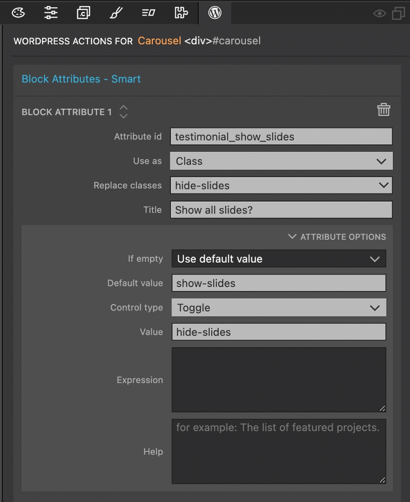
- Select the “Carousel” div that the toggle control was added onto.
- Add the class, “hide-slides” through the Property panel or hot key (CMD-L on Mac, CTL-L on Windows and Linux).
- Change the “Replace classes” of the existing Block Attribute action to “hide-slides”.
- Change the “title” input to “Show only active slide?”.
- Open the “Attribute Options” and add “show-slides” for the “Default value” input.
- Change the “Value” to “hide-slides”.
This will add the “show-slides” class to the carousel by default. Because the styling for “show-slides” is only added in the editor, having it present won’t impact our front-end design. This “show-slides” class will be swapped with a “hide-slides” class which has no styles applied.
Adding an active slide control
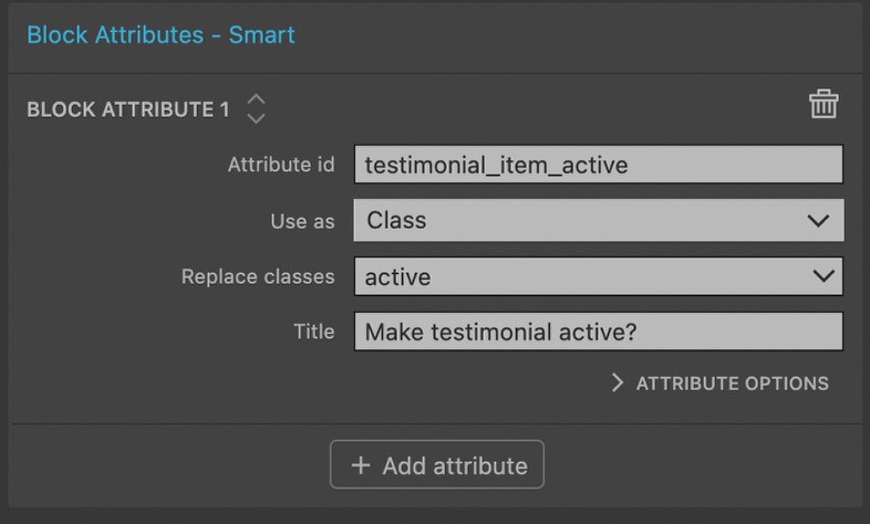
- Select the “Carousel slide” div where we added the “Block” action and add a “Block Attribute” action.
- Add an “Attribute id”, I used ‘testimonial_item_active’.
- Select “Class” for the “Use as” field and “active” for the “Replace classes” field.
- Enter a title – I entered a question that will be displayed to the user.
- In the “Attribute Options” section select “Toggle” as the “Control type” and “active” for the value.
- Open the Properties panel and remove the “active” class. This will cause our slide to disappear if we have JavaScript turned on.
If we save and export our theme we will see the new block controls. All of the slides will be shown by default and we can choose which is the first active slide.
Changing the slide controls
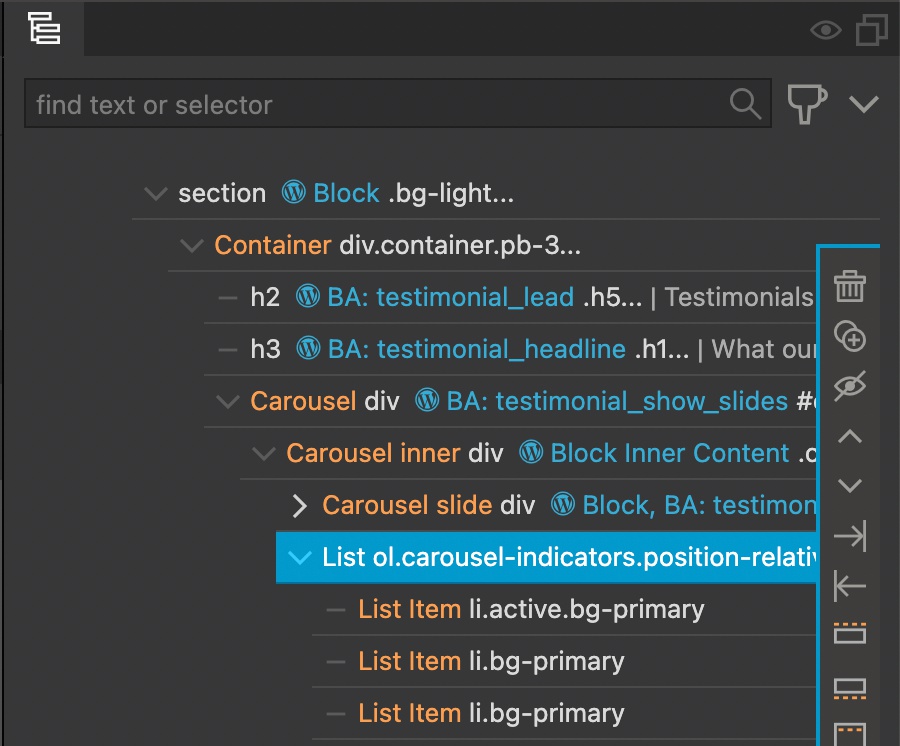
In the agency template the controls are breadcrumbs along the bottom of the carousel. Keeping this type of control system in place would require either that the end user adds a new breadcrumb element each time they add a new testimonial slide, or that we include custom code to generate the breadcrumbs. Instead, let’s change out the breadcrumbs for previous and next arrow navigation and use styling to move it beneath the slides.
- Select the existing controls located in the “list” element below the “Carousel slide” div.
- Delete the element.
- Copy the code below taken from the Bootstrap 5 documentation:
<div class="carousel-controls">
        <button class="carousel-control-prev" type="button" data-bs-target="#carouselExampleControls" data-bs-slide="prev">
            <span class="carousel-control-prev-icon" aria-hidden="true"></span>
            <span class="visually-hidden">Previous</span>
        </button>
        <button class="carousel-control-next" type="button" data-bs-target="#carouselExampleControls" data-bs-slide="next">
            <span class="carousel-control-next-icon" aria-hidden="true"></span>
            <span class="visually-hidden">Next</span>
        </button>
    </div>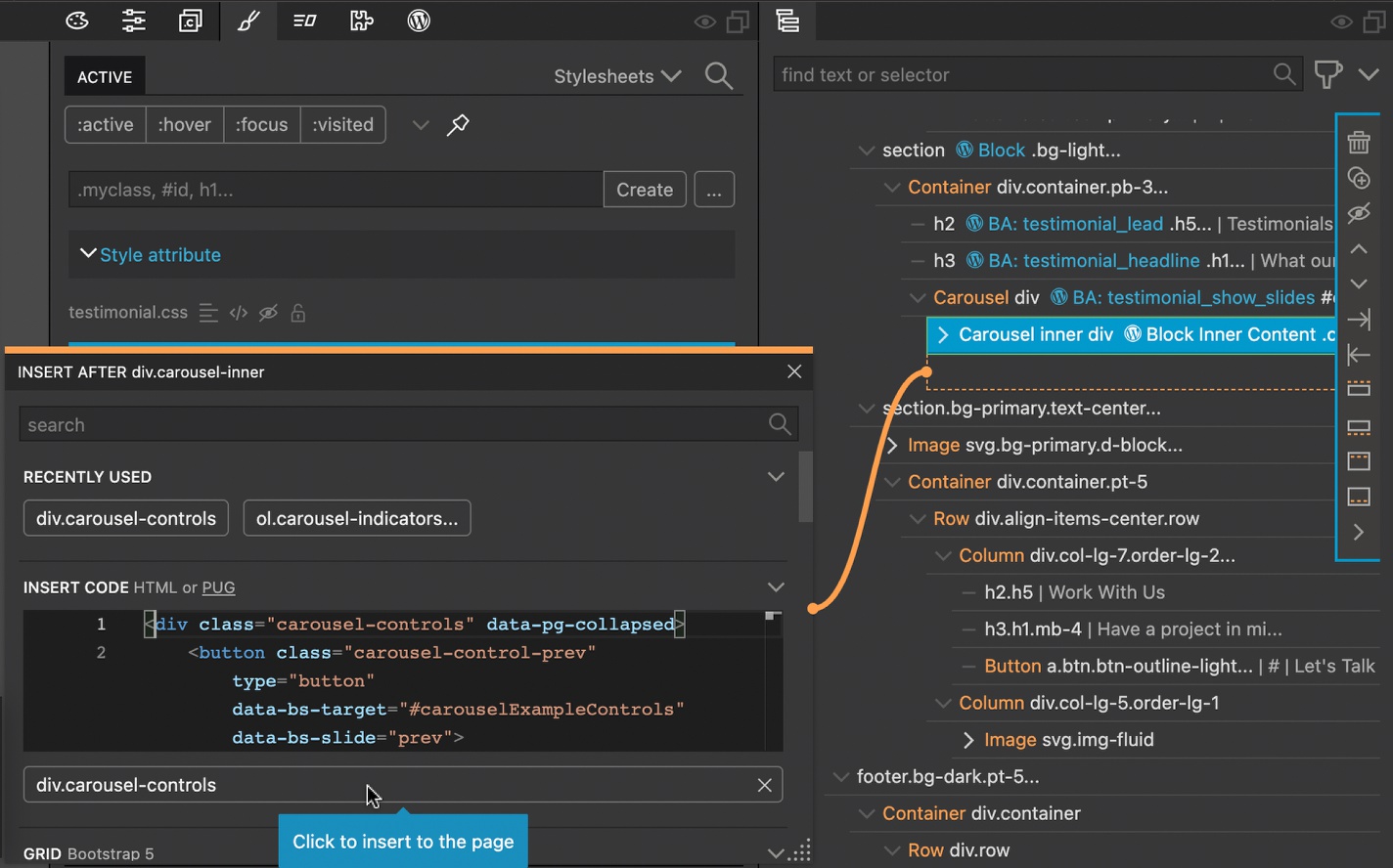
- Paste the code into the top code box in the Library panel and drag into the Tree panel at the same level as the”Carousel inner” div, or hover over the section of the Tree panel where the controls were removed, clicked the orange plus, then add the code into the box that appears and click to add. You might need to indent the inserted code with the controls along the right side of the Tree panel to make sure it inserts in the correct location.
- I want the controls to be centered up below the slide, so I will add the following styling:
.carousel-controls {
    display: flex;
    position: relative;
 }
 .carousel-controls .carousel-control-prev {
    justify-content: flex-end;
    width: 35%;
 }
 .carousel-controls .carousel-control-next {
    width: 35%;
    justify-content: flex-start;
 }
Add this code to the style sheet that will be loaded to both the front and back end. In the past tutorials we attached the “blocks.css” stylesheet to the editor, and the same sheet was already being loaded on the front-end.
Hooking up the controls
Right now if we were to export our theme and try it out on the front-end of our WordPress site, the controls wouldn’t work. That is because the controls need an attribute set to target a specific carousel. In fact, the end user would also run into problems if they added more than one carousel to the page because of conflicting ids.
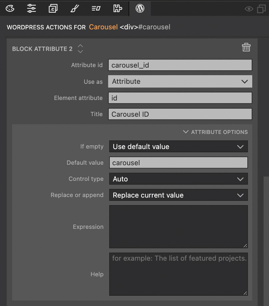
- Select the “Carousel” div from either the Page View or the Tree panel.
- Click the “+ Add attribute” button at the bottom of the existing “Block Attribute” control.
- Add an “Attribute id”, select “Attribute” for “use as”, Type “id” into the “Element attribute” input, and add a title.
- Open the “Attribute Options” section, add “carousel” for the “Default value” and make sure “Replace current value” is selected in the “Replace or append” input.
Next, we will use a little trick for the controls. Since ids do not have to be unique within a block we can add new targets to the controls anytime the user changes the carousel id.
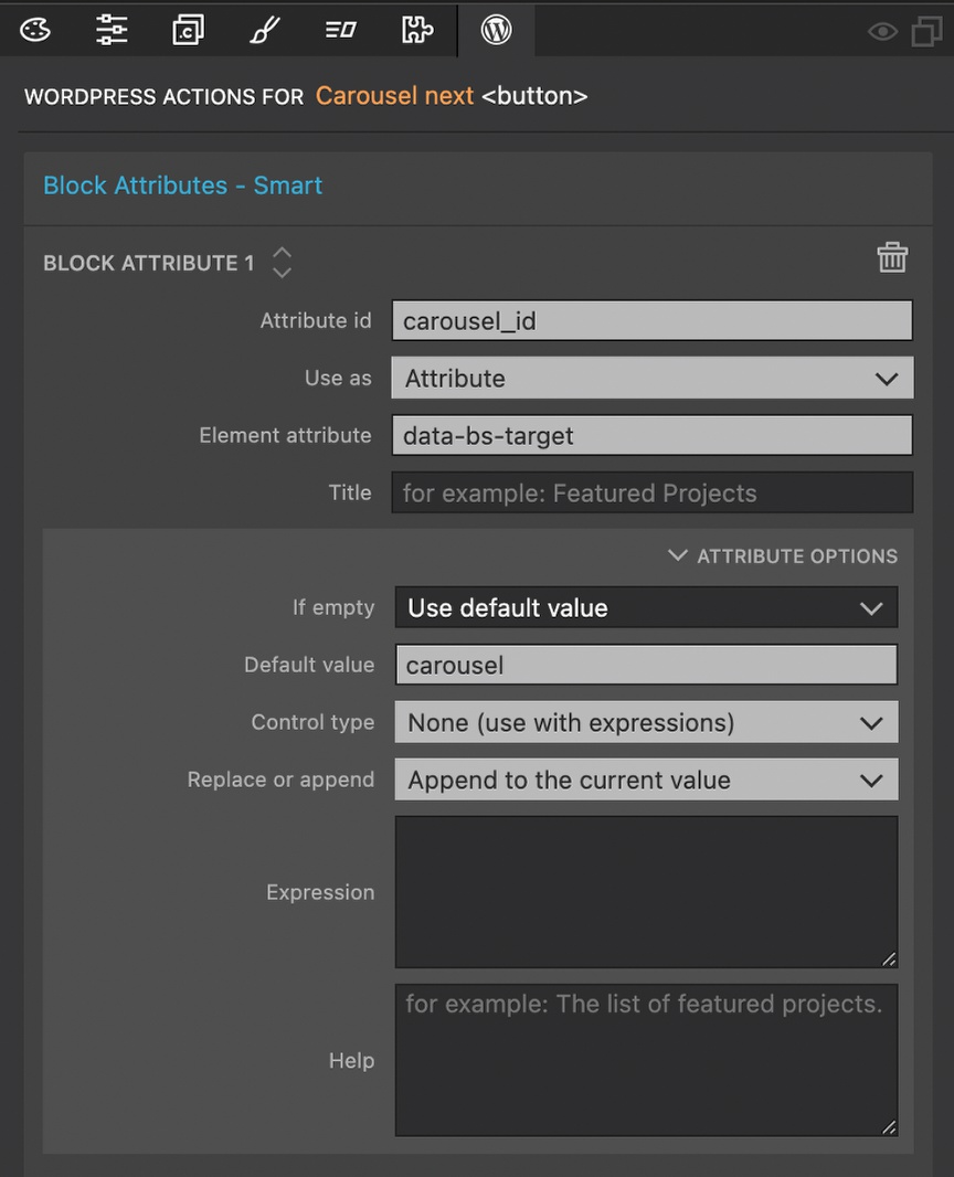
- Select the “Carousel prev” button.
- Change the “data-bs-target” value to “#” in either the Properties panel, or the code editor. Do the same for the “Carousel next” button.
- Next, reselect the “Carousel prev” button and add a “Block Attribute” action.
- For “Attribute id” use the exact same id you added to the “Carousel” div – in this example it was “carousel_id”.
- Select “Attribute” for “Use as” and type “data-bs-target” for the “Element attribute”. You can skip the title since it won’t be shown to the end user
- In the “Attribute Options” section add a “Default value” of “carousel”. For “Control type” select “None”. For the “Replace or append” input select to append.
- Finally, click on the clipboard icon that appears when you hover at the very top of the “Block Attributes” to copy the action. Then right-click on the “Carousel next” button in the Tree panel, select “Paste” and pick the action.
Wrap-up
That’s it! We now have a functional Bootstrap carousel that is also editor friendly.
In the next tutorial I will add new templates for showing our post content and post archives along with a few new blocks.
Until next tutorial, have fun designing with Pinegrow!
Discuss this tutorial
Have questions or comments about this tutorial? Let’s talk about it on our forum.
Get in touch
Would you like to see your favorite theme or blocks library featured in the next tutorial? Let us know in the forum or by email!