It’s a fact. Images are an integral part of almost any website.
But, when adding images to your site, it is essential not only to choose those that will impact your audience but also to think about your service’s efficiency and performance. Because yes, on the web, size and weights matter, and seeking to improve your visitors’ browsing experience is a good thing.
If the artistic & creative choice remains parts of the editorial line of your service, on the technical side, WordPress offers to almost magically and effectively manage the performance aspect through the use of predefined image sizes but also, since version 4.4, through the automated handling and management of responsive images.
WordPress proceeds by using the srcset attribute.
To make it short and almost non-technical, it is a list of URLs of images of various sizes that will be served depending on the page view resolution.
WordPress also adds the loading= “lazy” attributes to instruct the browser to defer loading of images off-screen until the user scrolls near them.
But what’s going on under the hood?
To handle the srcset attribute and benefit from the responsive images in your publications (Posts and Pages), WordPress uses the same images at the different sizes it creates when you upload an image to the Media Library.
Then, when publishing a post or a page, all you have to do is upload/select an image from the Media Library, and WordPress will take care of the situation by generating different sizes and adding the right HTML code to serve responsive images.
WordPress default image sizes
If you check a WordPress setup that you have just installed and have not modified anything nor added a custom theme, you can see the default sizes generated when you upload a new image.
This view is available from the Media Settings screen.
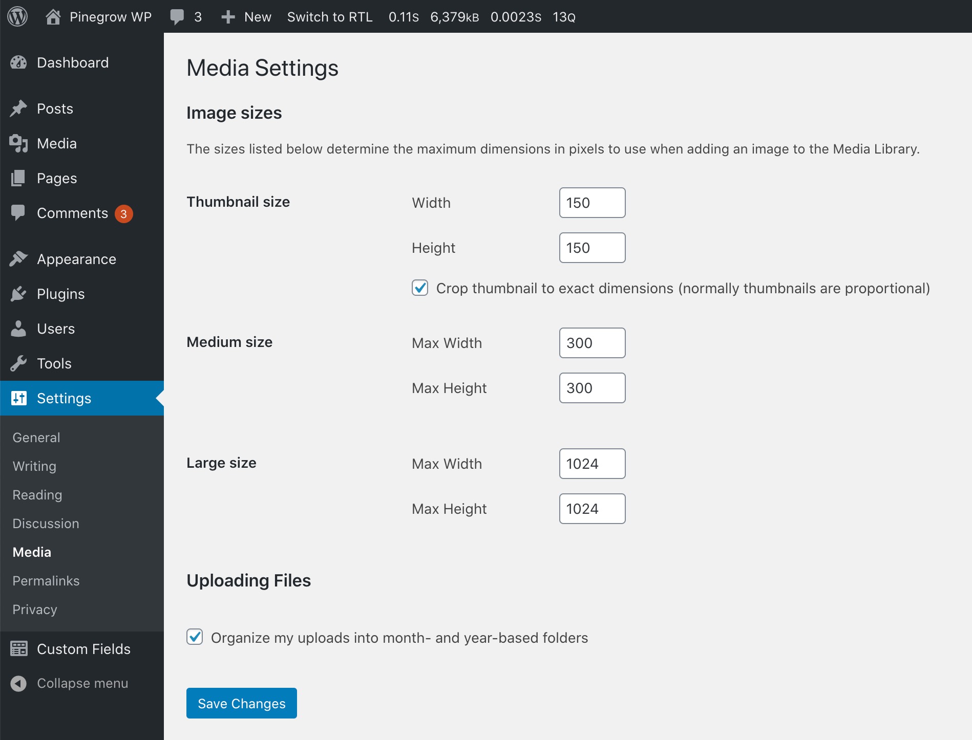
Thumbnail
150×150
Crop thumbnail to exact dimensions (usually thumbnails are proportional)
Medium
Max width: 300
Max height: 300
Large
Max width: 1024
Max height: 1024
But that’s not all. Under the hood, WordPress also generates specific image formats in the context of responsive image support and for which there are no visible customization options.
Medium-large
Max Width: 768
Medium_large is not visible from the Media Settings screen, nor can it be modified. Its role is to take advantage of responsive image support, so it is not visible on the settings page.
You can also fully customize the default WordPress image sizes.
To proceed from Pinegrow, go to your WordPress Theme Settings screen, tweak the IMAGE SIZES section then export your theme again.
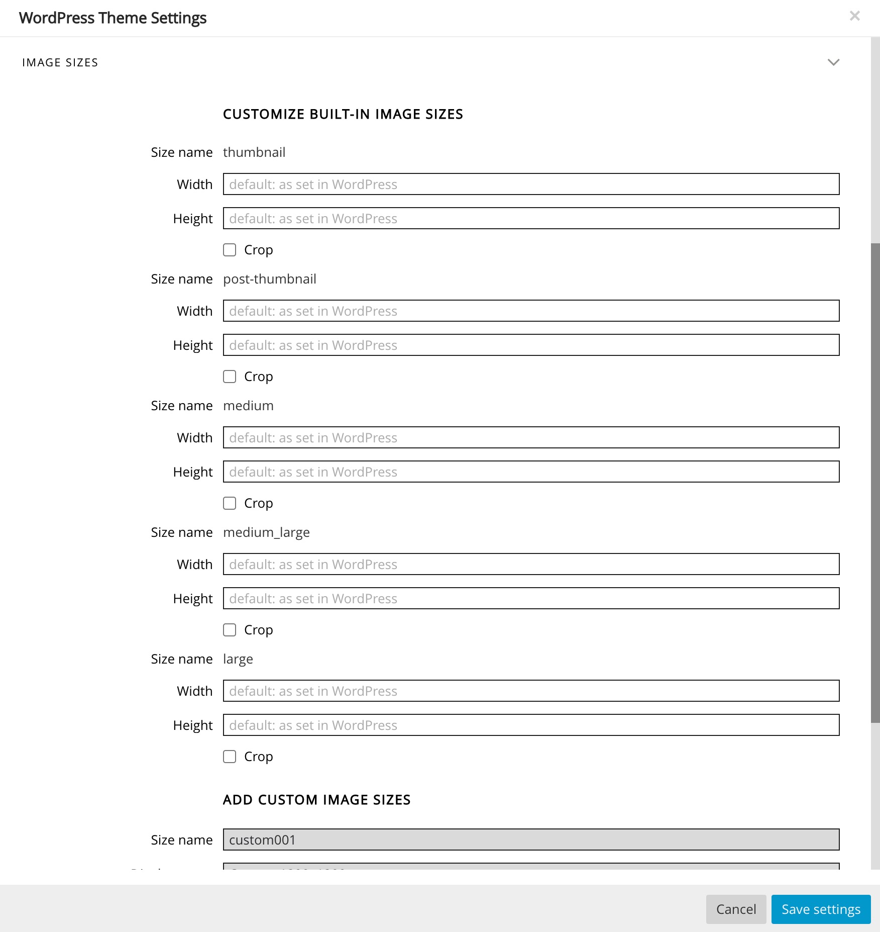
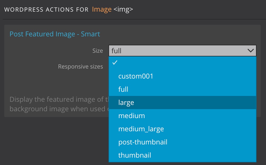
From Pinegrow, using Post Featured Image – Smart, Featured Image Bck, Attachment Image, Attachment Image Src, Attachment Image Bck smart actions, you can select one of the available sizes (default ones, and custom ones).
How are very large images handled?
WordPress will define if a new image is a Big image based on whether its height or Width is above the big_image threshold default value.
This default threshold value is set to 2560px (this produces JPEGs (photos) of approximately 850KB), but this can be changed using the big_image_size_threshold filter.
This is done within your functions.php or inc/custom.php file.
If an image’s height or Width is above this threshold, it will be scaled down – with the threshold being used as max-height and max-width value.
Then, the scaled-down image will be used as the largest available size.
WordPress will then generate new image sizes as in-between. (1536×1536 and 2048×2048)
Both sizes are not visible nor can be modified from the Media settings as they are available only to take advantage of responsive image support and are not meant to be used as independant image formats.
Pinegrow Guess responsive sizes feature.
From Pinegrow, when using the Post Featured Image – Smart action, you will find the very useful Guess responsive sizes option.
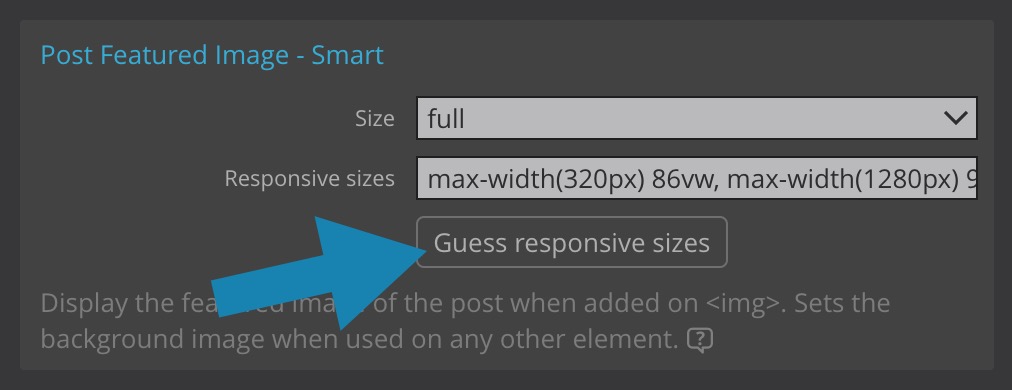
The <sizes> attribute tells the browser how many pixels it needs by describing your image’s final rendered Width.
Think of <sizes> as a way to give the browser a bit of information about the page’s layout a little ahead of time so that it can pick a source before it has parsed or rendered any of the page’s CSS.
By testing the display of your document, Pinegrow will guess the possible responsive sizes.
With both a size’s length and a set of sources with w descriptors in srcset to choose from, the browser will have everything it needs to load an image in a fluid, responsive layout efficiently.
Easily Define custom image sizes with Pinegrow.
Depending on your theme/site layout, in addition to the standard image sizes set by default, you can also decide to add your custom image sizes.
This can be easily done from your theme settings in Pinegrow.
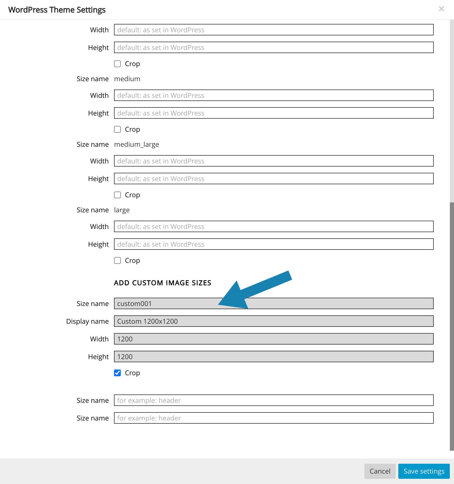
IMPORTANT: The new sizes will be added as parameters in the functions.php file and will NOT be visible from the Media Settings screen in WordPress.
ONE MORE THING
To take advantage of the image block’s specific features and the ability to use Embeds (videos, images, tweets, audio, and other content) in responsive mode, you will need to add the following lines to your functions.php file or inc/custom.php.
Define the maximum Width for your content.
Using this feature, you can set the maximum allowed Width for any theme content, like oEmbeds and images added to posts.
Using this theme feature, WordPress can scale oEmbed code to a specific size (Width) in the front-end and insert large images without breaking the main content area.
 // Set content-width.
    global $content_width;
    if ( ! isset( $content_width ) ) {
        $content_width = 1080;
    }
Activate the support for wide image alignment and responsive embeds.
From the WordPress editor (Gutenberg), some blocks, such as the image block, can define a “wide” or “full” alignment by adding the corresponding class name to the block’s wrapper ( alignwide or alignfull ).
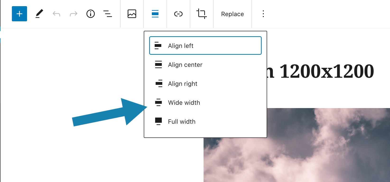
To make the content of embed blocks resize and keep its aspect ratio, the <body> element needs the wp-embed-responsive class.
This is not set by default, and requires the theme to opt in to the responsive-embeds feature:
function pg_images() {
    // Add support for wide images
    add_theme_support( 'align-wide' );
    // Add support for responsive embeds
    add_theme_support( 'responsive-embeds' );
}
add_action( 'after_setup_theme', 'pg_images' );
Also, to bootstrap your WordPress theme project and offer better support for images and videos in your layouts, you can add the following styles to your style.css file.
Disclaimer: The following elements are offered only as inspiration and can negatively impact if you already integrate specific styles in your template. They are exclusively suggestions.
body {
    overflow-x: hidden;
}

img,
video {
    height: auto;
    max-width: 100%;
}

.alignfull {
    width: 100vw;
    max-width: 100vw;
    margin-left: calc(50% - 50vw);

    /* text-align: center; */
}

@media only screen and ( min-width: 1800px ) {
    .alignwide {
        margin-left: -80px;
        margin-right: -80px;

        /* text-align: center; */
    }
}
Making Youtube videos oEmbded full-width
Maybe you also want to integrate Youtube videos in full width display and don’t know how to do it?
We had the opportunity to test (with success) these few lines to add to your style.css file.
We cannot guarantee these elements’ universality, as each custom theme can integrate different visual aspects and settings. Nevertheless, this is a good starting point.
It’s up to you.
/* Make YouTube videos inserted via WordPress oEmbed full-width */
.wp-block-embed-youtube {
    overflow: hidden;
    position: relative;
    max-width: 100%;
    height: auto;
    padding-bottom: 56.25%;
}

.wp-block-embed-youtube iframe,
.wp-block-embed-youtube object,
.wp-block-embed-youtube embed {
    position: absolute;
    top: 0;
    left: 0;
    width: 100%;
    height: 100%;
}
Useful tools
Regenerate Thumbnails allows you to regenerate all thumbnail sizes for one or more images that have been uploaded to your Media Library.
This is useful for situations such as:
- A new thumbnail size has been added and you want past uploads to have a thumbnail in that size.
- You’ve changed the dimensions of an existing thumbnail size, for example, as seen in this document, via the Media Settings.
- You’ve switched to a new WordPress theme that uses featured images of a different size.
It also offers the ability to delete old, unused thumbnails in order to free up server space.
Useful links
To go further and learn more about responsive image support in WordPress, we invite you to check out the following links.