These Bootstrap 3 element properties can be set for any element on the page.
Let’s list all general Bootstrap 3 sections in the Element properties. We won’t go into explaining how Bootstrap works here. We’ll only mention things specific to working with Bootstrap in Pinegrow that are not self-evident.
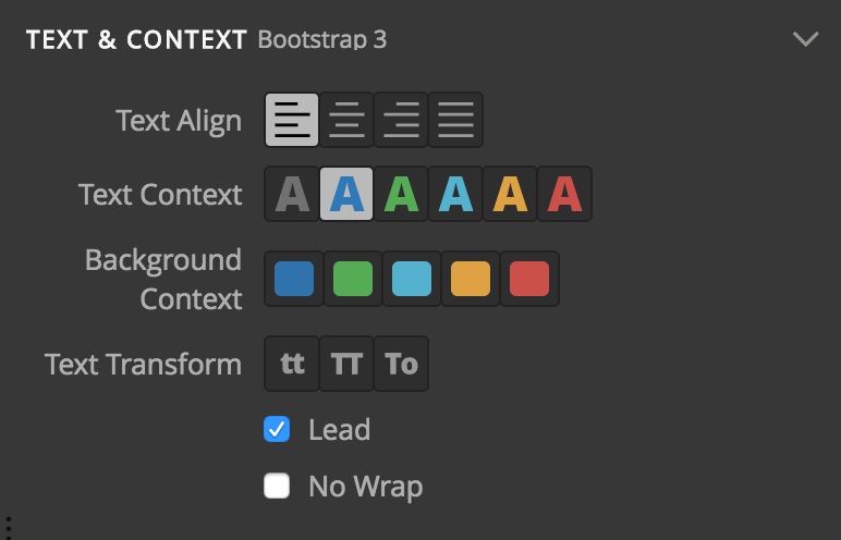
Text & Content
Layout
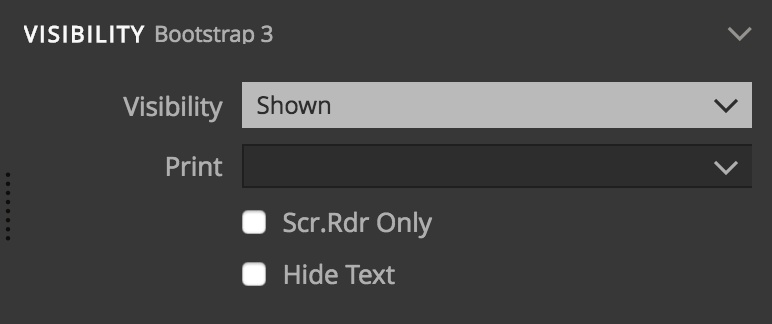
Visibility
Responsiveness
This Bootstrap setting requires a short explanation. Other responsive Bootstrap settings, like column span, affects the device size where the setting is set and all sizes above that – unless a different setting is specified for those sizes.
But this property affects only the size for which it is set and implicitly negates the value for all other sizes.
For example, setting SM to visible will make the element visible only on the SM size. And the element will be hidden in all other sizes, both smaller and larger unless the property is set on them as well.
Tooltip
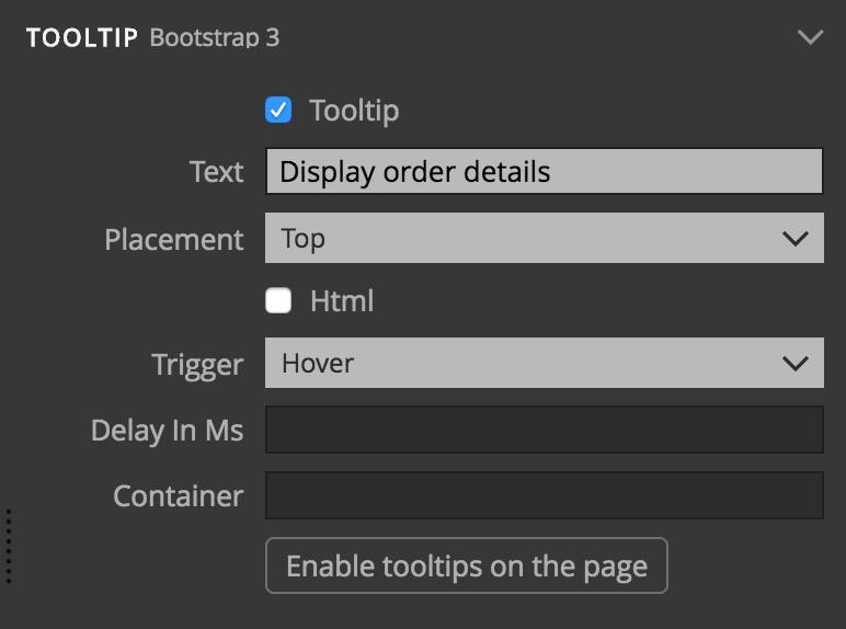
Check the Tooltip checkbox and set the parameters to display a tooltip on the selected element.
In Bootstrap, tooltips are not enabled by default. You need to activate them by explicitly calling the .tooltip() method. The general code that does that for all tooltips on the page is:
$(‘[data-toggle=”tooltip”]’).tooltip();
Press the “Activate tooltips” button to add this code to the page or copy-paste it to a Javascript file.
Popover
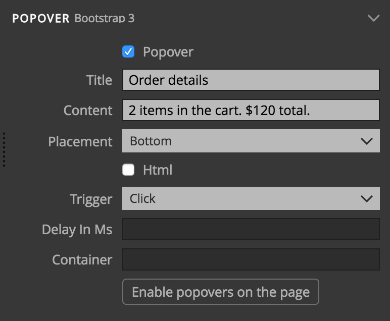
Popovers are very similar to tooltips, described above.
They are also not activated by default. The code to activate all popovers on the page is:
$(‘[data-toggle=”popover”]’).popover();
Press the “Activate popovers” button to add this code to the page or copy-paste it to a Javascript file.
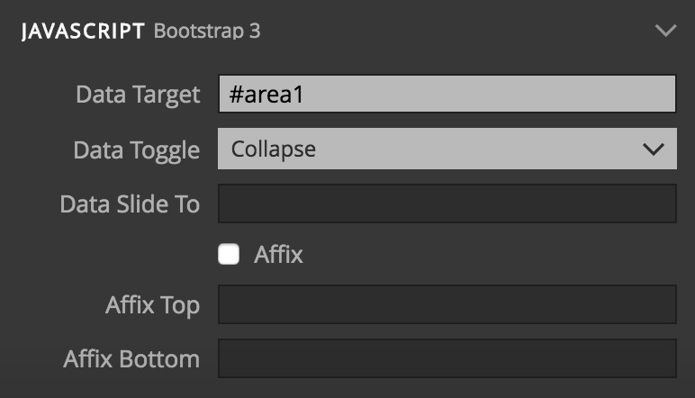
Javascript
The Javascript section contains properties that control some of Bootstrap Javascript features. For many of them, Pinegrow provides a more convenient controls, for example, trigger selector tool for modals. Those controls map values back to these properties.
