How-to use Material Design for Bootstrap (MDB) UI Kit with Pinegrow
Material Design for Bootstrap is a popular and highly customized version of Bootstrap 4 with 500+ material UI elements, 600+ material icons, 77+ CSS animations, 9+ useful plugins, SASS source files, templates, tutorials and many more. As you will discover in this tutorial, it is the perfect candidate to start a web project with Pinegrow.
Material Design for Bootstrap (MDB) is available for jQuery, Angular , React and Vue however, in this tutorial we will focus only on the jQuery version.
Material Design for Bootstrap is free for personal and commercial use and if you want to go any further, you can consider purchasing the PRO version which contain even more goodies, scripts and components.
The process we are going to detail is valid for both the FREE and PRO versions. It is up to you to choose the version that will best suit your projects and/or your budget.
Disclaimer
The following is a series of methods, tips and tricks to best organize your web project using MDB FREE and Pinegrow Web Editor.
Of course, if you are an advanced user, you may decide to do things differently.
Pinegrow has no affiliate relationship with MDBootstrap.com.
Getting the free version of the MDB framework
To download the free version of the MDB Framework, go to the MDB Website.
Select the DOWNLOAD ZIP button.
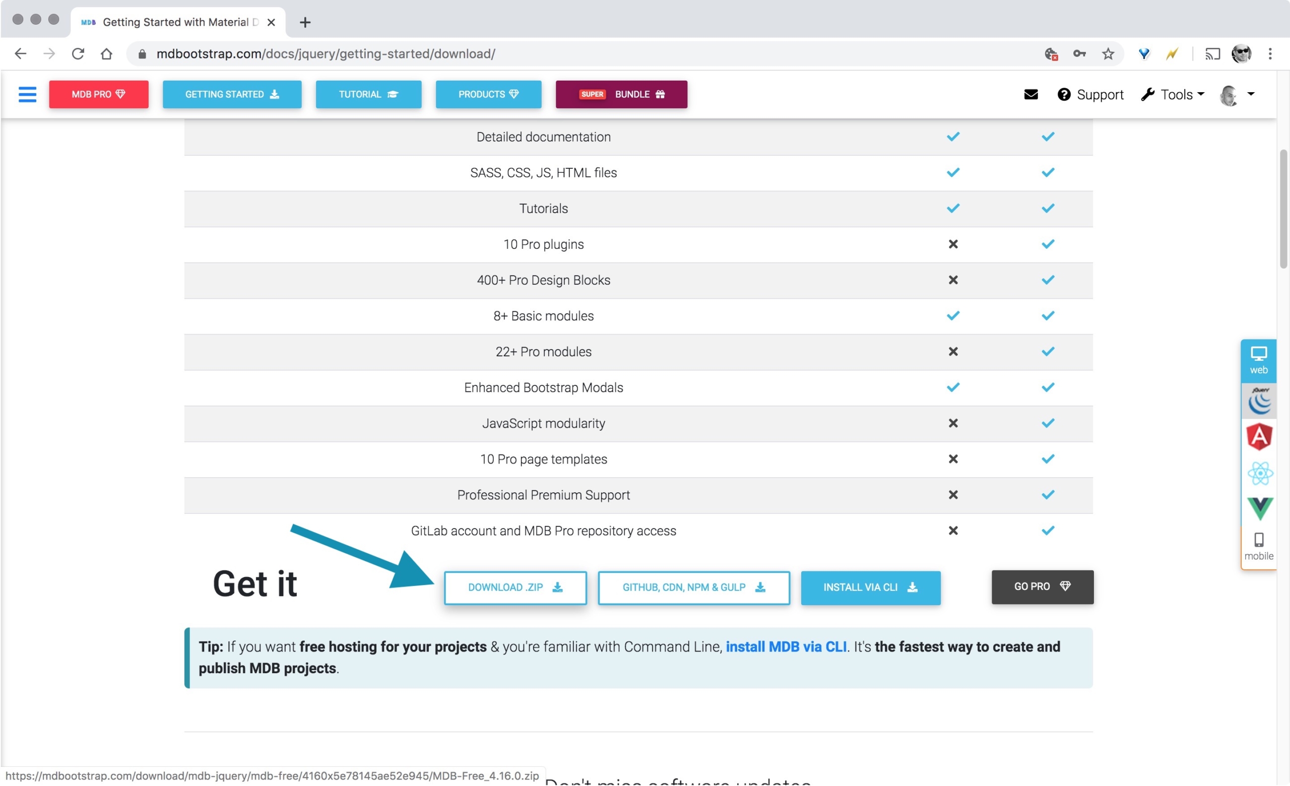
Then unzip the ARCHIVE on your hard drive.
Preparing the MDB framework for your next web project
You can use the MDB framework as is, directly in Pinegrow, however, we recommend to proceed to a few changes so your project will be well organized. Showing how to do that is the main purpose of this tutorial.
By default, the MDB framework uses minified versions of the CSS files. Because we believe minification is one the very last step of the development phase, we will use the un-minified version of the CSS which we will associate to its SASS source file that Pinegrow will compile on the fly when we make changes.
Start Pinegrow.
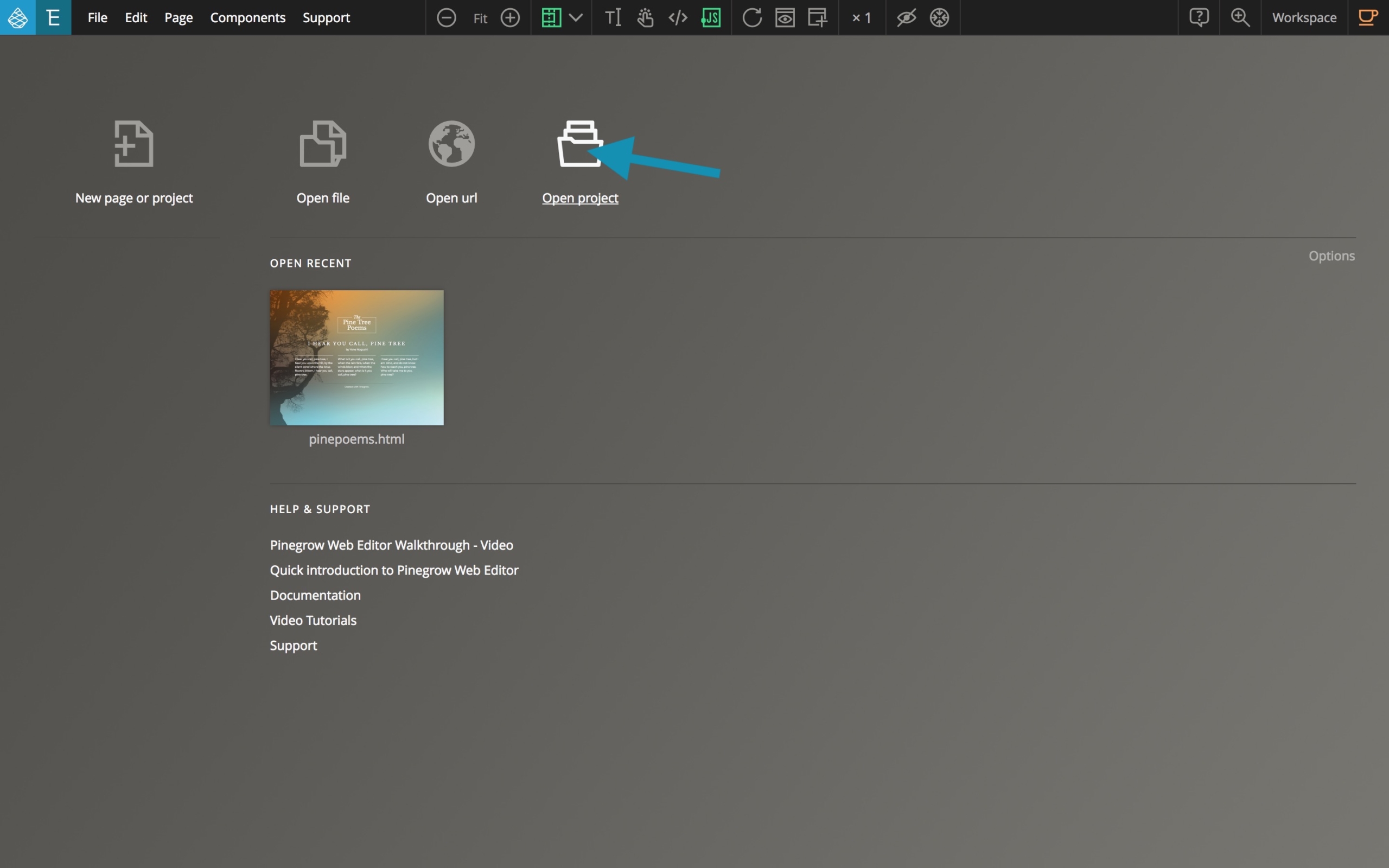
From the Pinegrow dashboard view > Select Open Project.
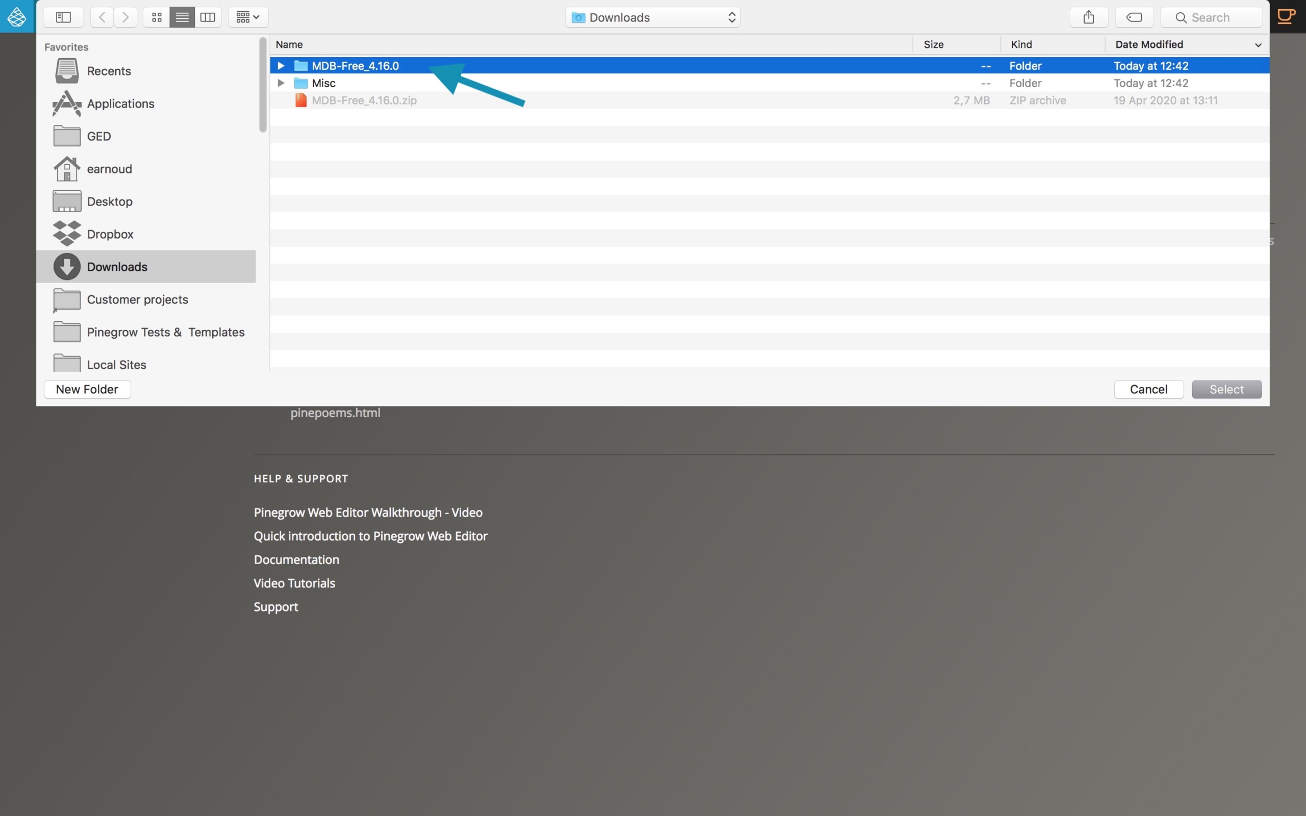
Navigate to the location where you extracted the previously downloaded archive. Click on the MDB folder and click Select.
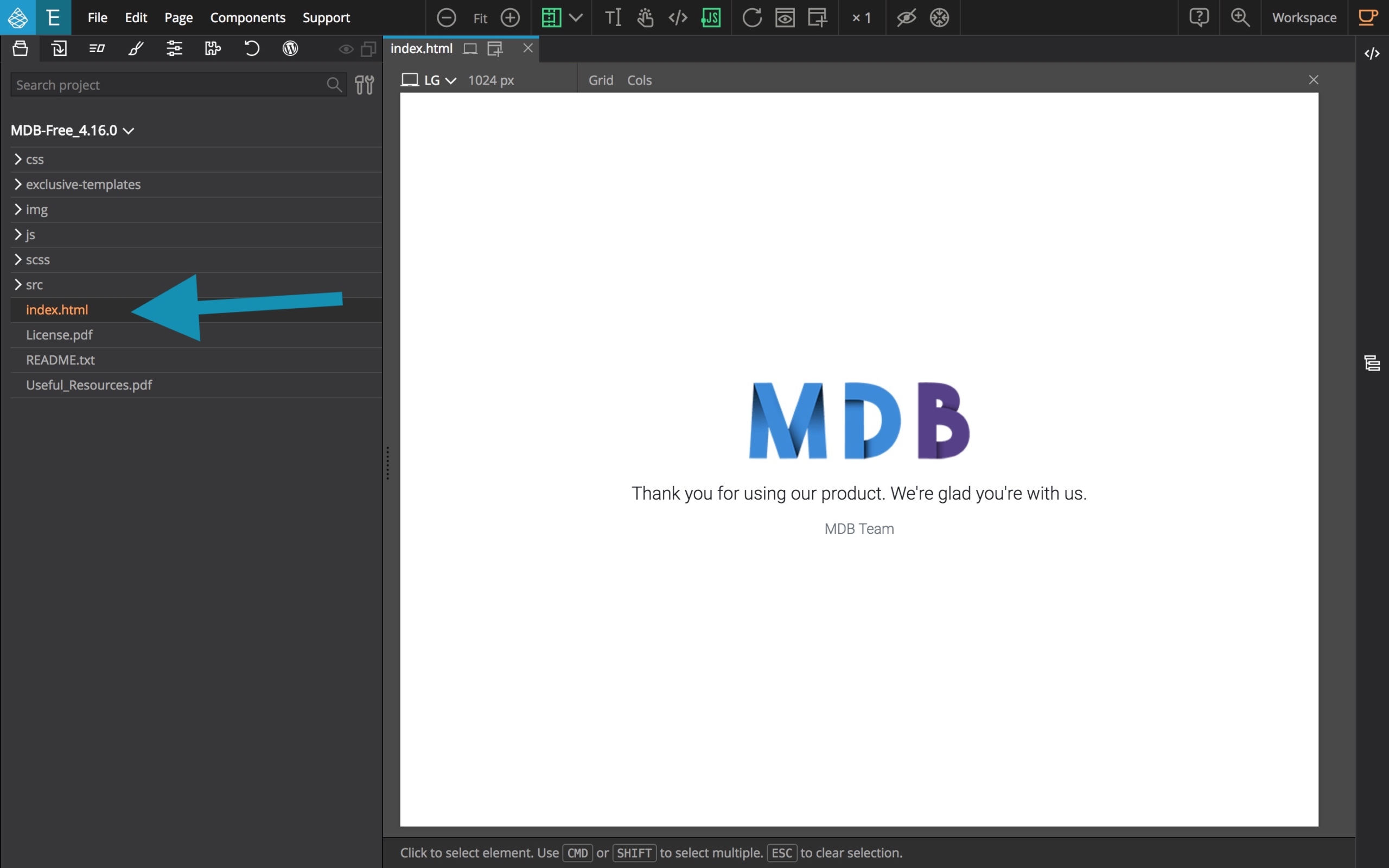
From the Project tab, select (open) index.html.
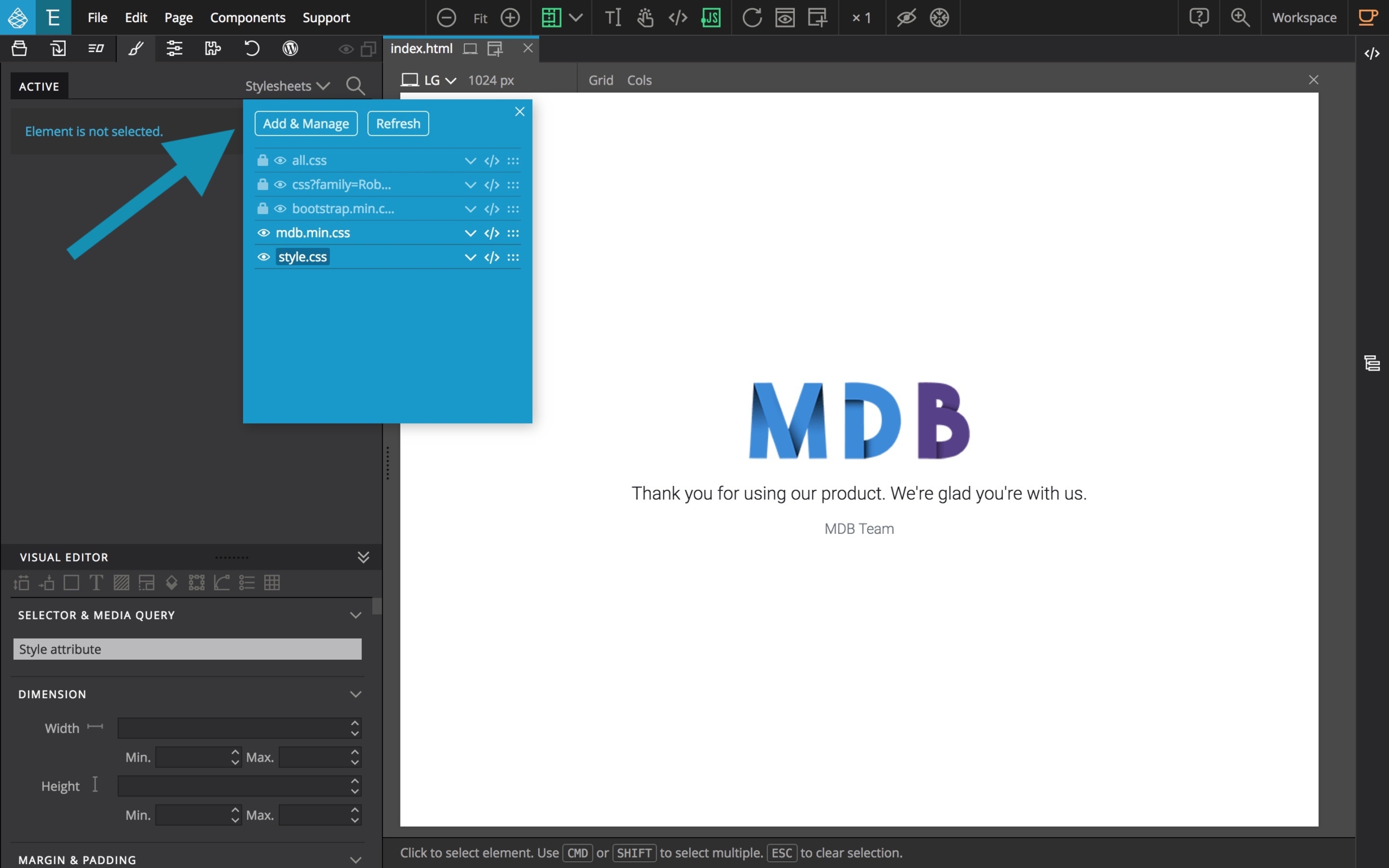
From the Style tab, click on the Stylesheets manager button.
The, select Add & Manage.
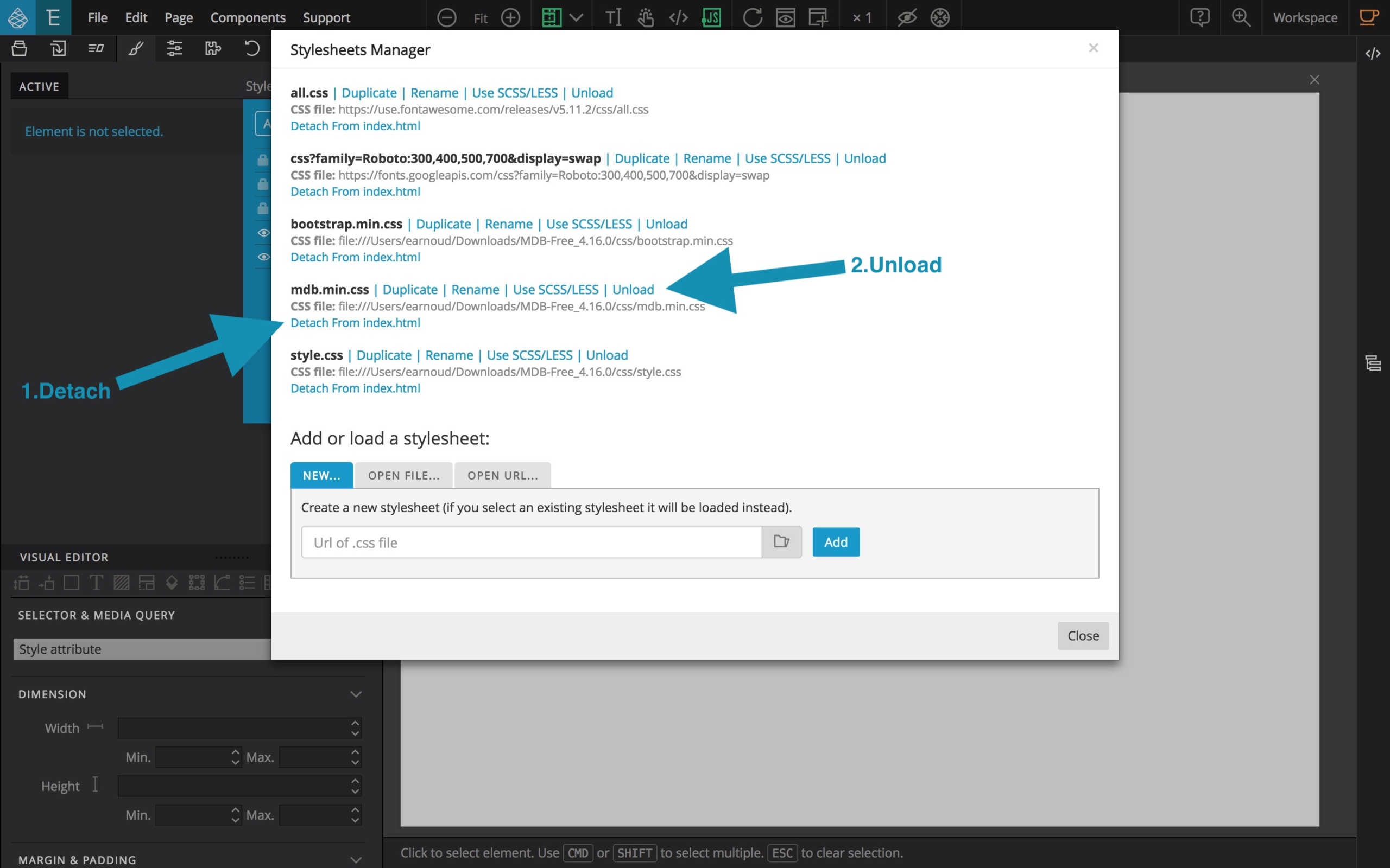
Find the line with mdb.min.css and click on Detach from index.html.
Then click on unload. The corresponding line will disappear.
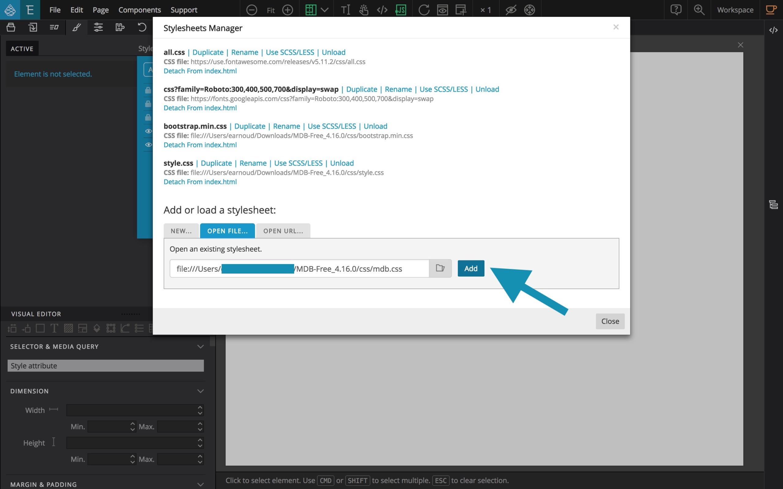
Now, from the Add or load a stylesheet section, select open file.
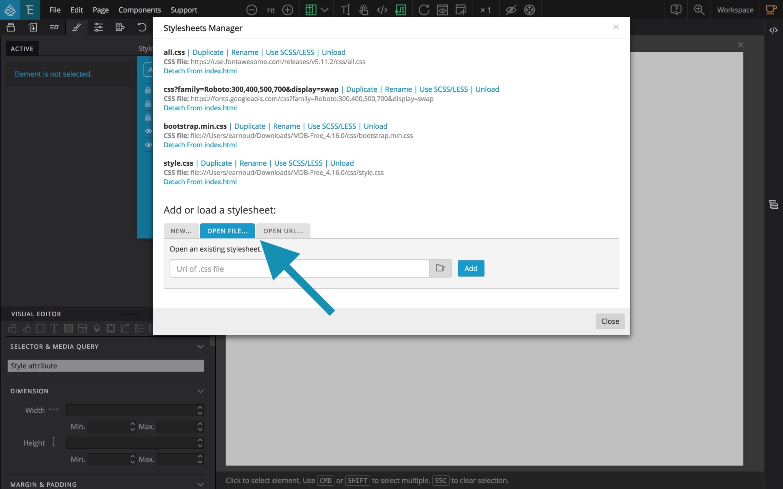
Click on the file selector icon.
From the CSS folder, select mdb.css which is the un-minified version of the custom MDB stylesheet.
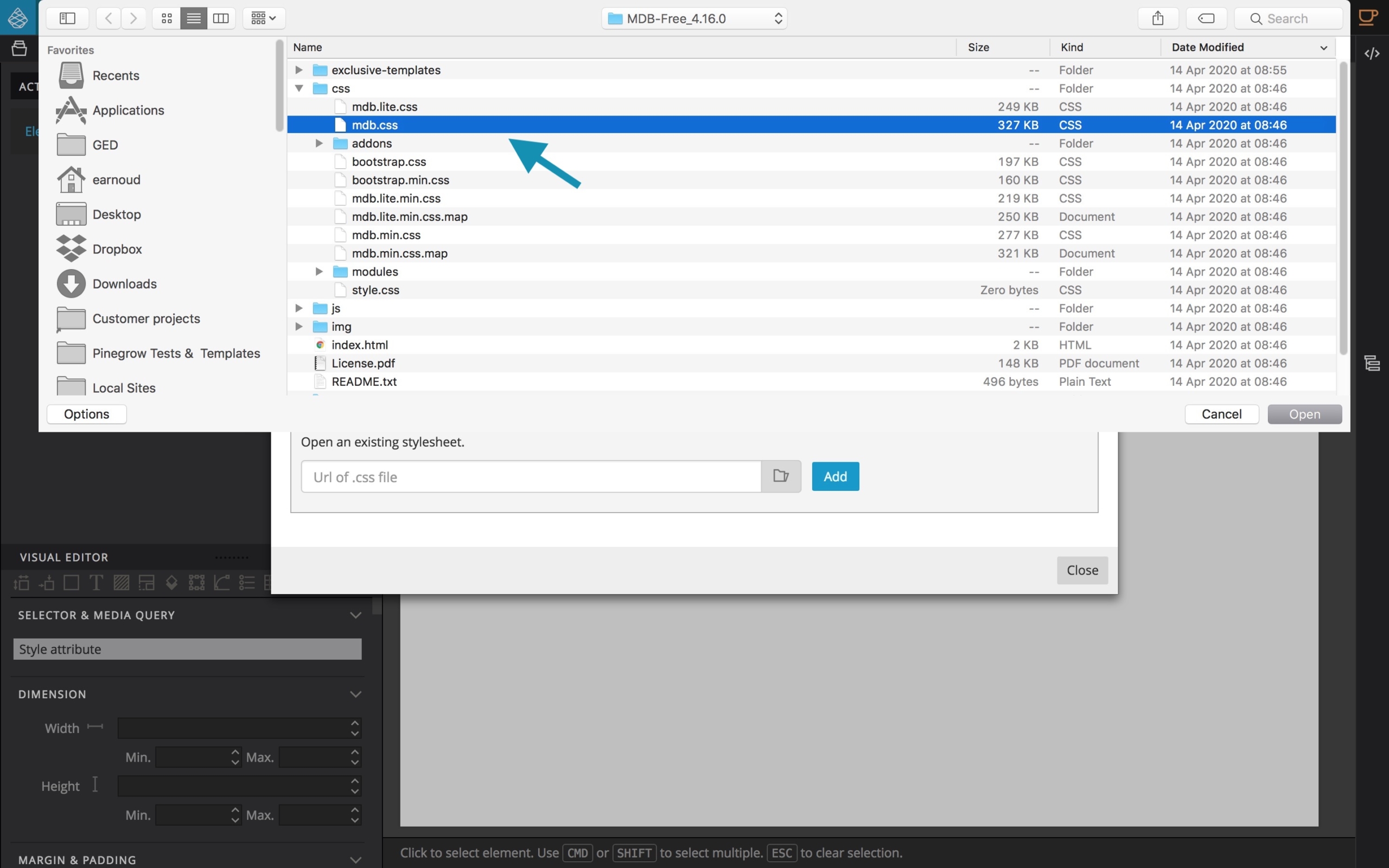
Then, click the blue Add button.
Read carefully and Say OK to the useful Tip provided by Pinegrow. This is an invitation to ATTACH the mdb.css to your index.html file.
Click on Attach to index.html.
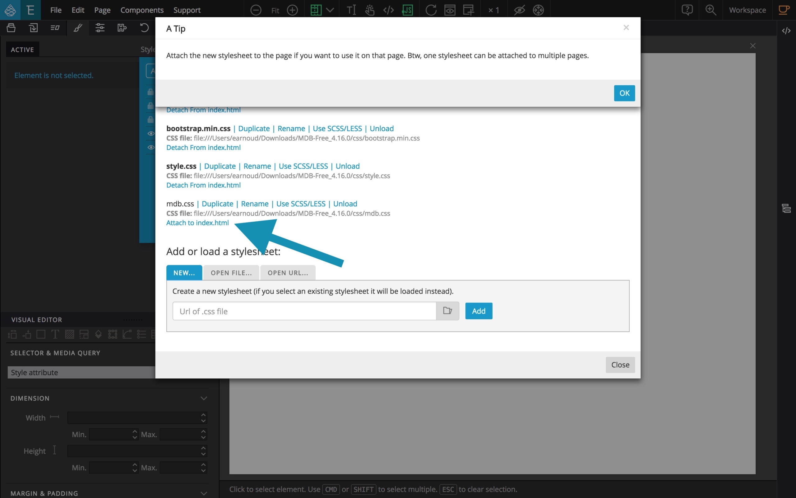
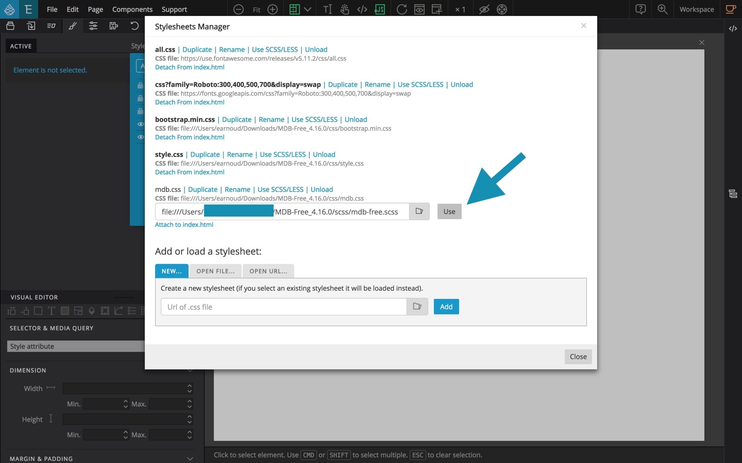
Now, it’s time to select the SASS source for this CSS so you have to select the Use SCSS/LESS file link.
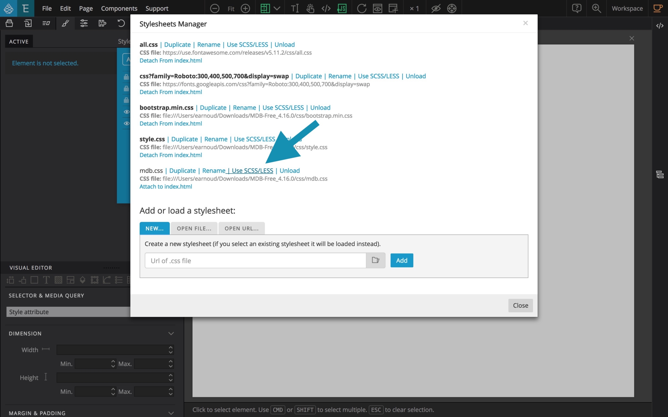
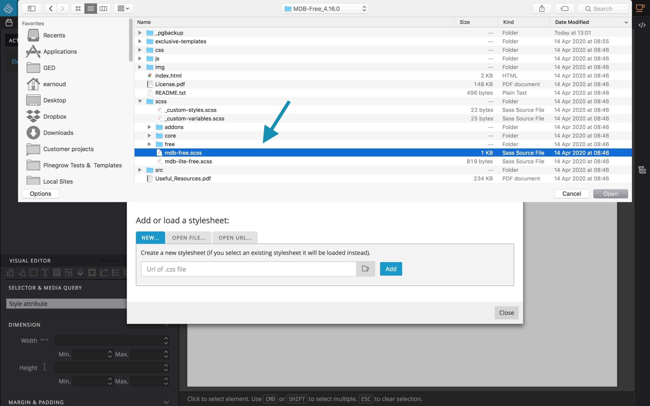
Click on the File selector icon.
From the SCSS folder, select mdb-free.scss and click on Open.
Then, click on the Use button.
Immediately after, you will see the new content in the Stylesheets manager. All the include files associated to the main SASS file will be visible.
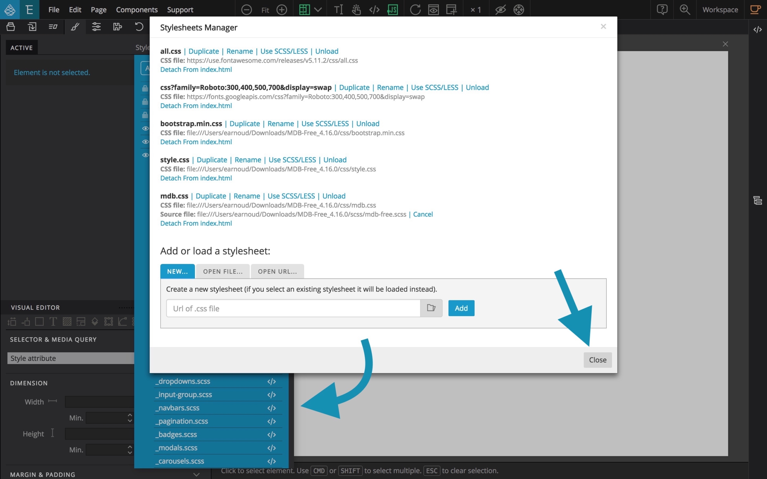
Click on Close .
Now, from the tree panel, uncollapse the head of the document.
Locate the css/mdb.css element, and move it BEFORE the css/style.css element.
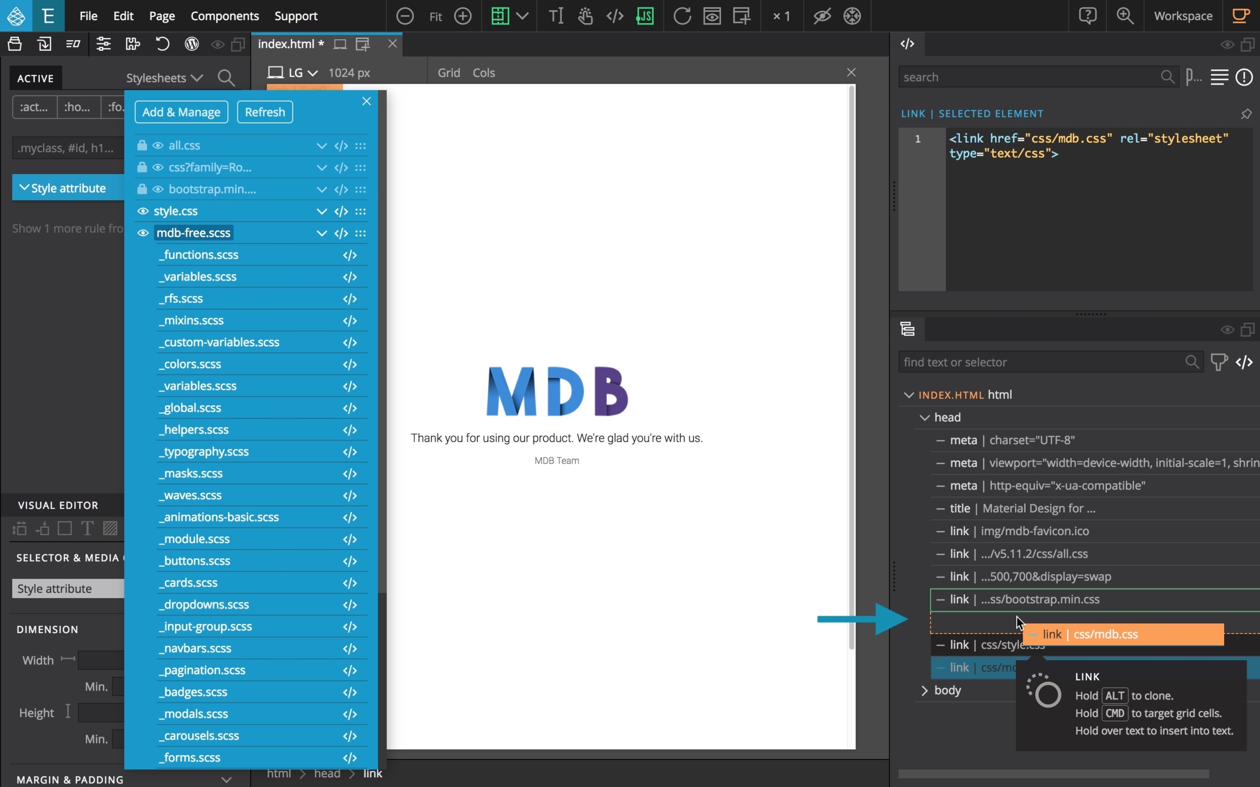
Save your document.
Close the stylesheets viewer.
From the tree, you can now safely remove the default DIV element from the index.html file so you will have an empty index document to start your webdesign project.
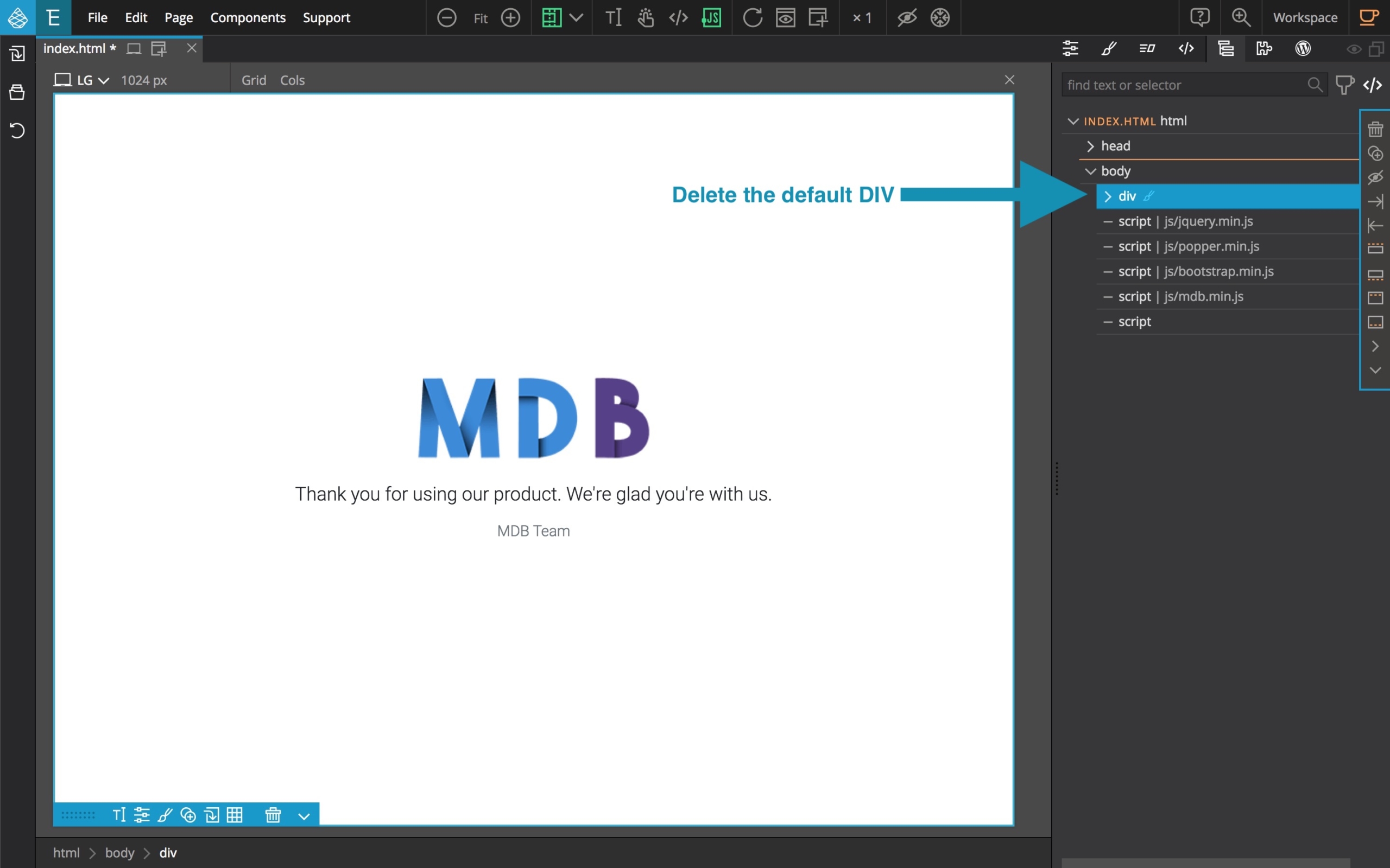
Save your project. Optionally, you can create a copy so that you can start your future projects with this modified version.
Working with Pinegrow and MDB
Within Pinegrow Web Editor, Material Design for Bootstrap can be used in two ways which can be combined depending on your needs.
Method 1 – Using Pinegrow Bootstrap components and tools
You can use Bootstrap 4 components available from the Pinegrow library in the same way you would when working with any other Bootstrap 4 project.
This lets you to build your site with ease. The standard Bootstrap 4 components will be automatically styled with the MDB styles.
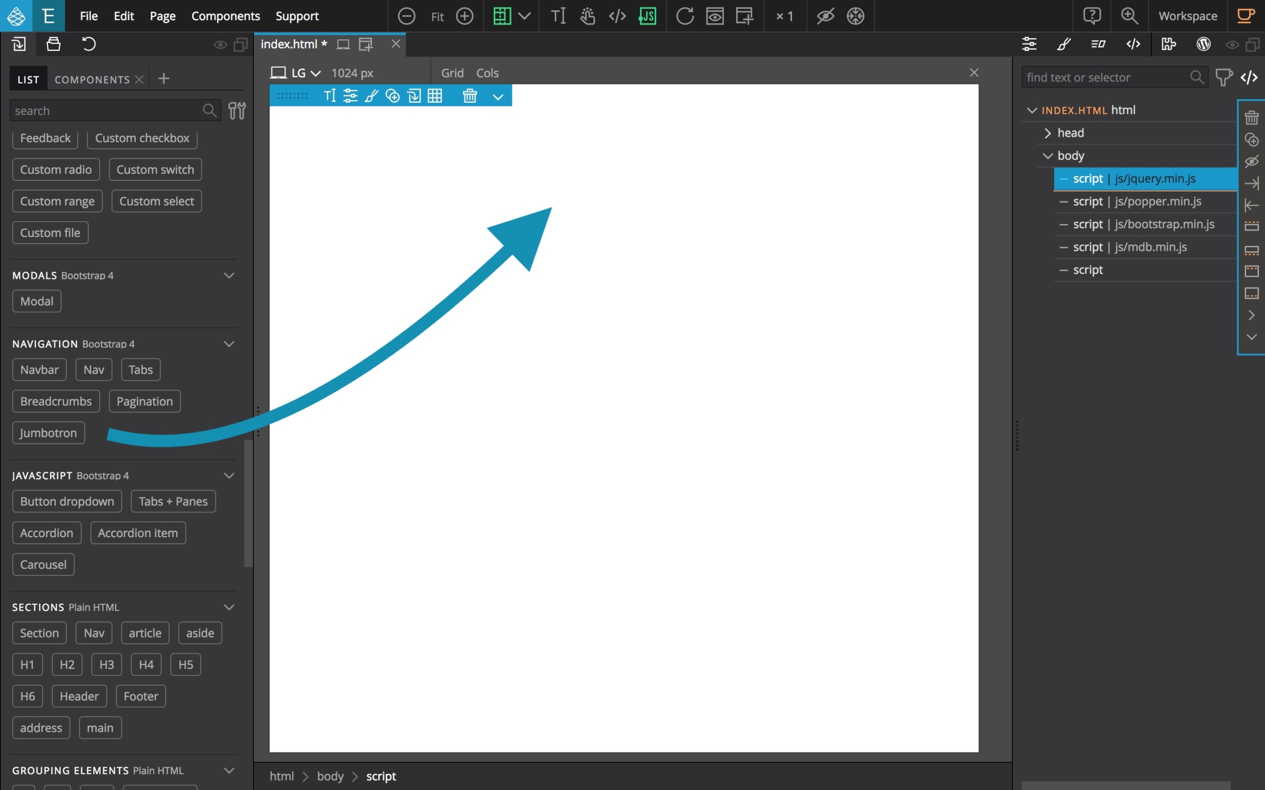
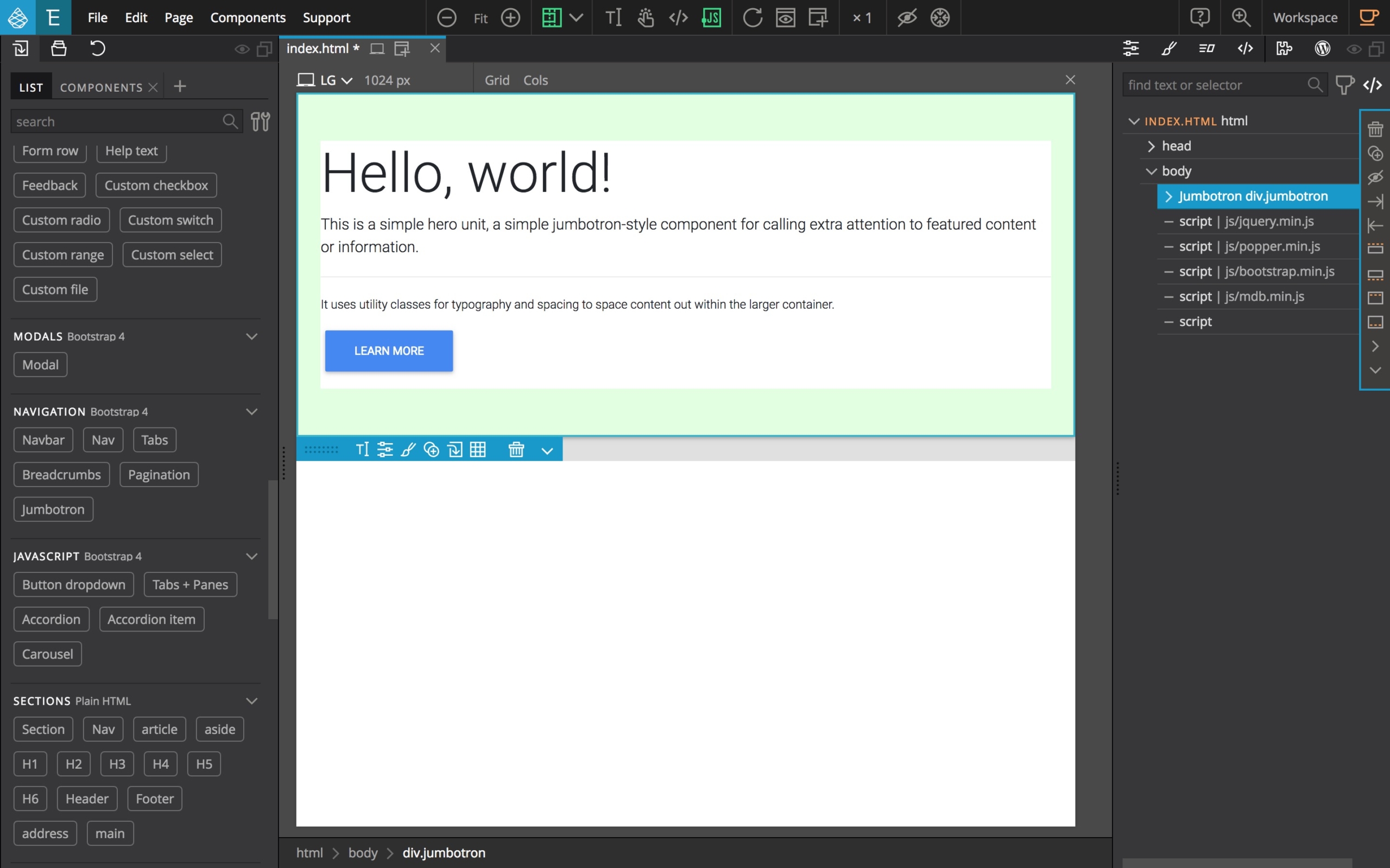
For example, let’s add a standard Bootstrap 4 Jumbotron from the Pinegrow library.
Read more about how to use Pinegrow to build websites.
Method 2 – Copy code from MDB website
Another method is to follow the documentation available from the MDB website and use the available code snippets by copy/pasting them via the super useful Insert code option in Pinegrow.
You will be able to easily import the sample code as needed and eventually create your own components that you will even have the opportunity to reuse in other future projects thanks to Pinegrow smart components feature.
Again, let’s try with a custom Jumbotron component.
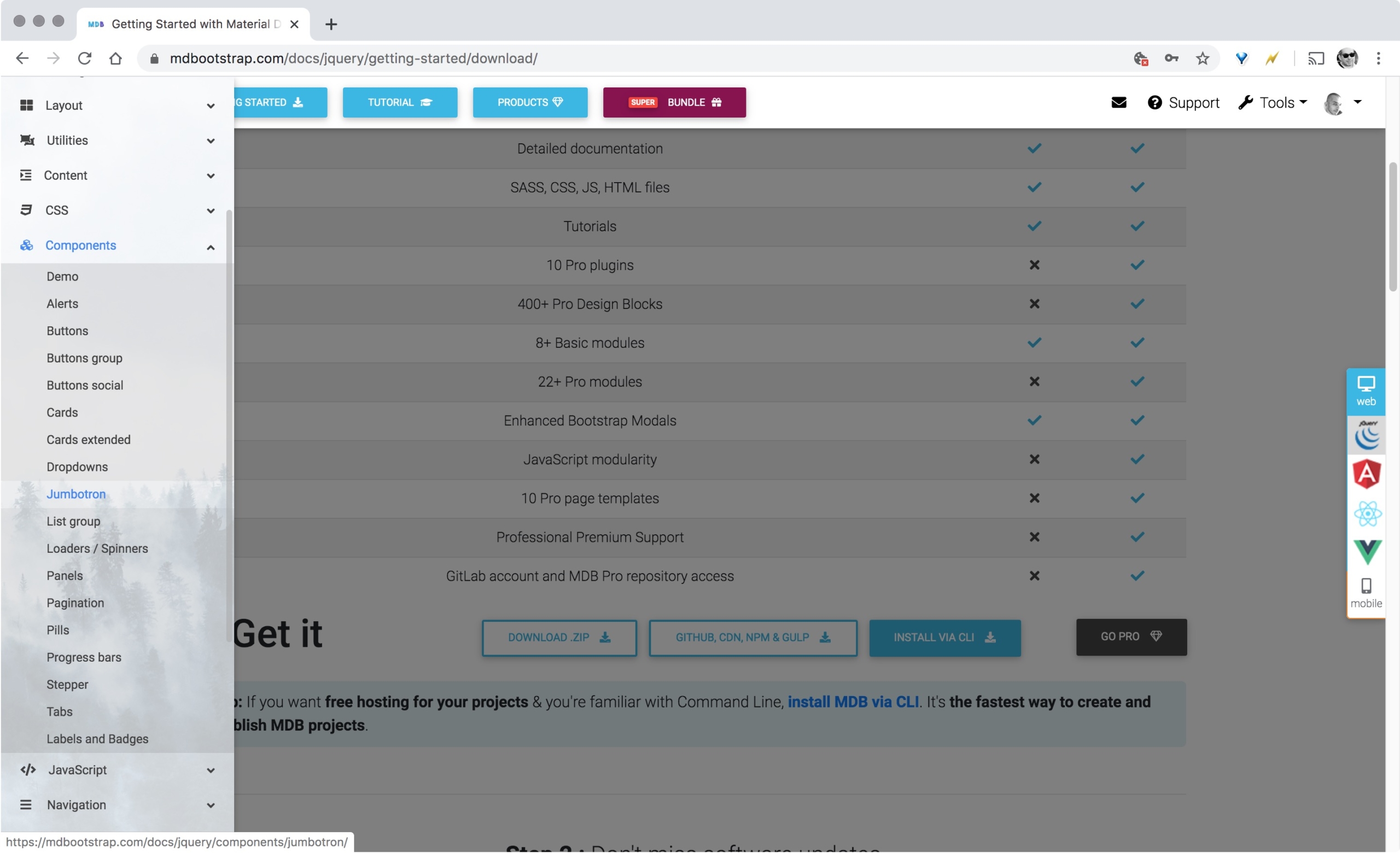
Go to https://mdbootstrap.com/docs/jquery/components/jumbotron/
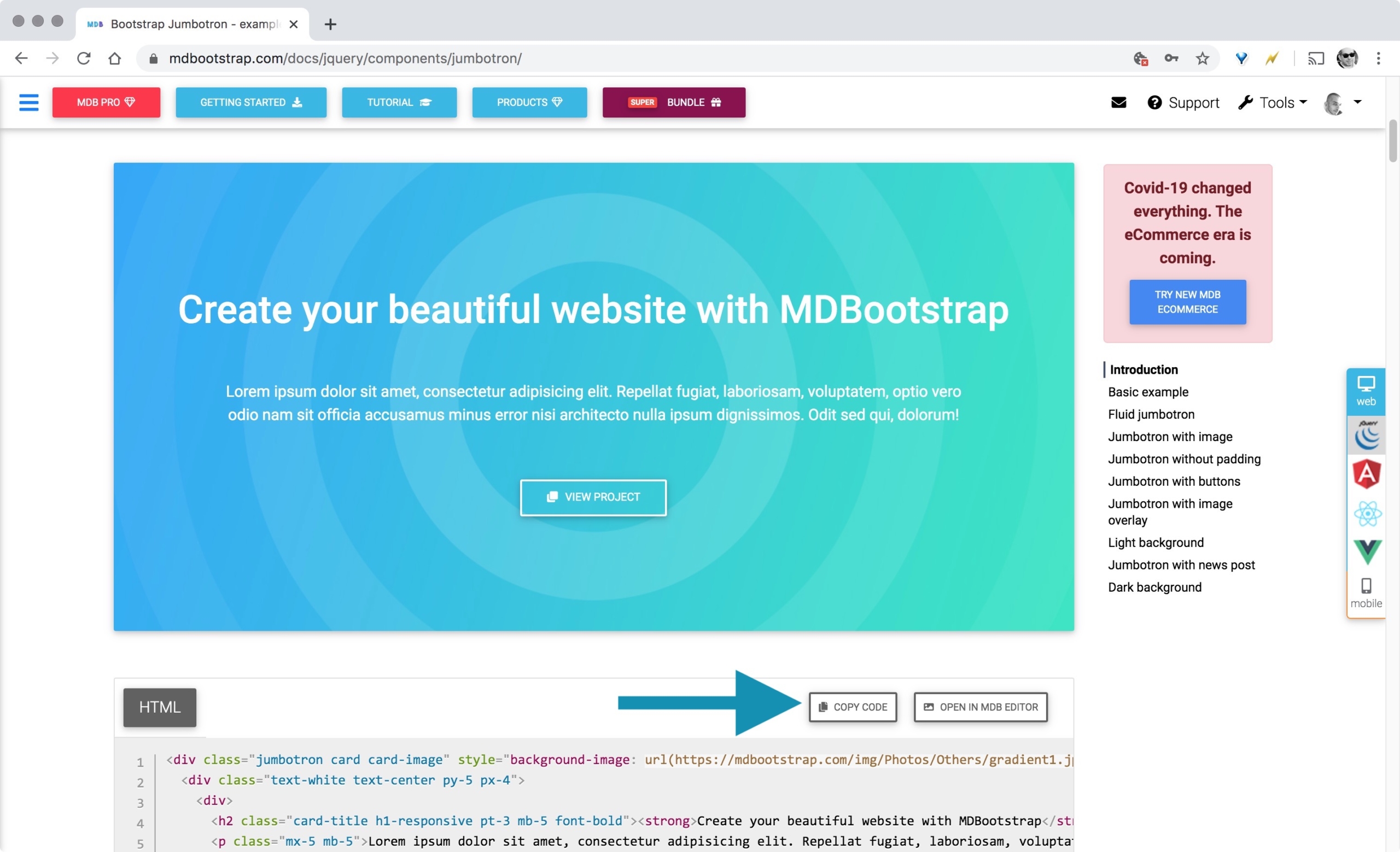
From the browser, copy the code snippet from the first example by clicking on the COPY CODE button. You can also select the code with the mouse and use CTRL+C on Windows or CMD+C on Mac.
Then, from Pinegrow, switch to library tab, locate the INSERT CODE component and paste the code using CTRL+V on Windows or CMD+V on Mac.
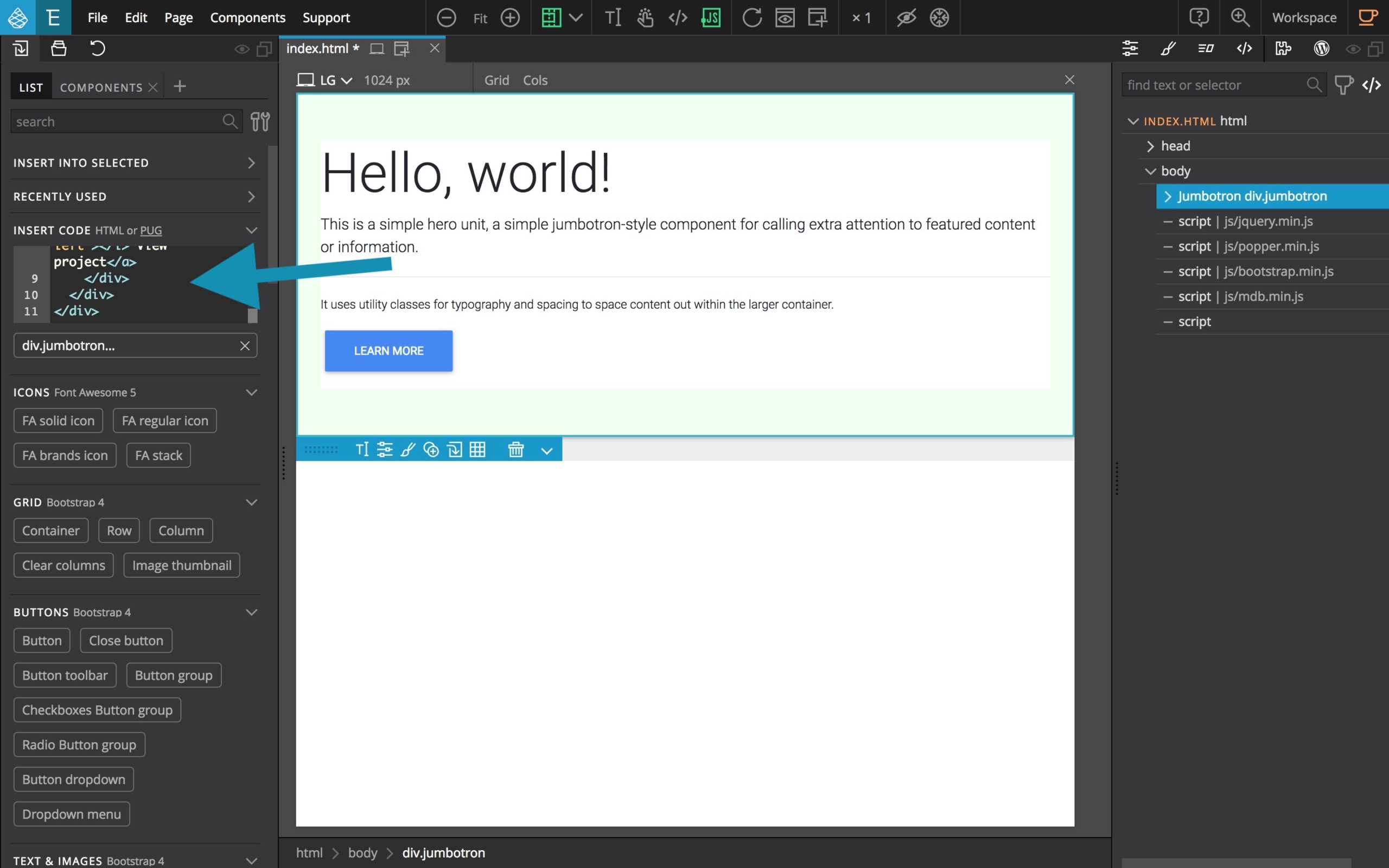
You now have a virtual component with the custom Jumbotron that you just have to drag and drop to the page or to the tree.

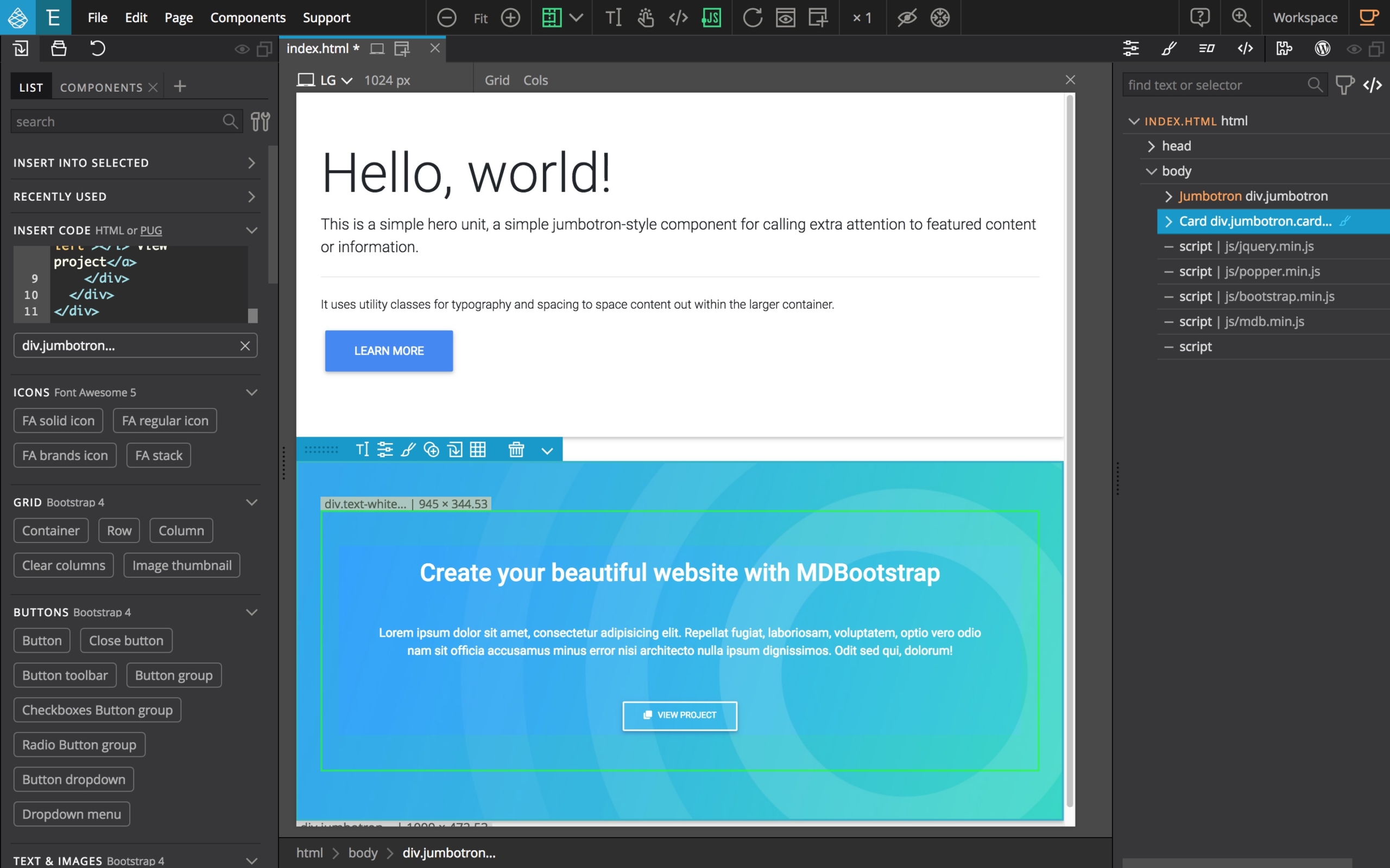
The beautiful customized Jumbotron from the MDB documentation is now added to your document!
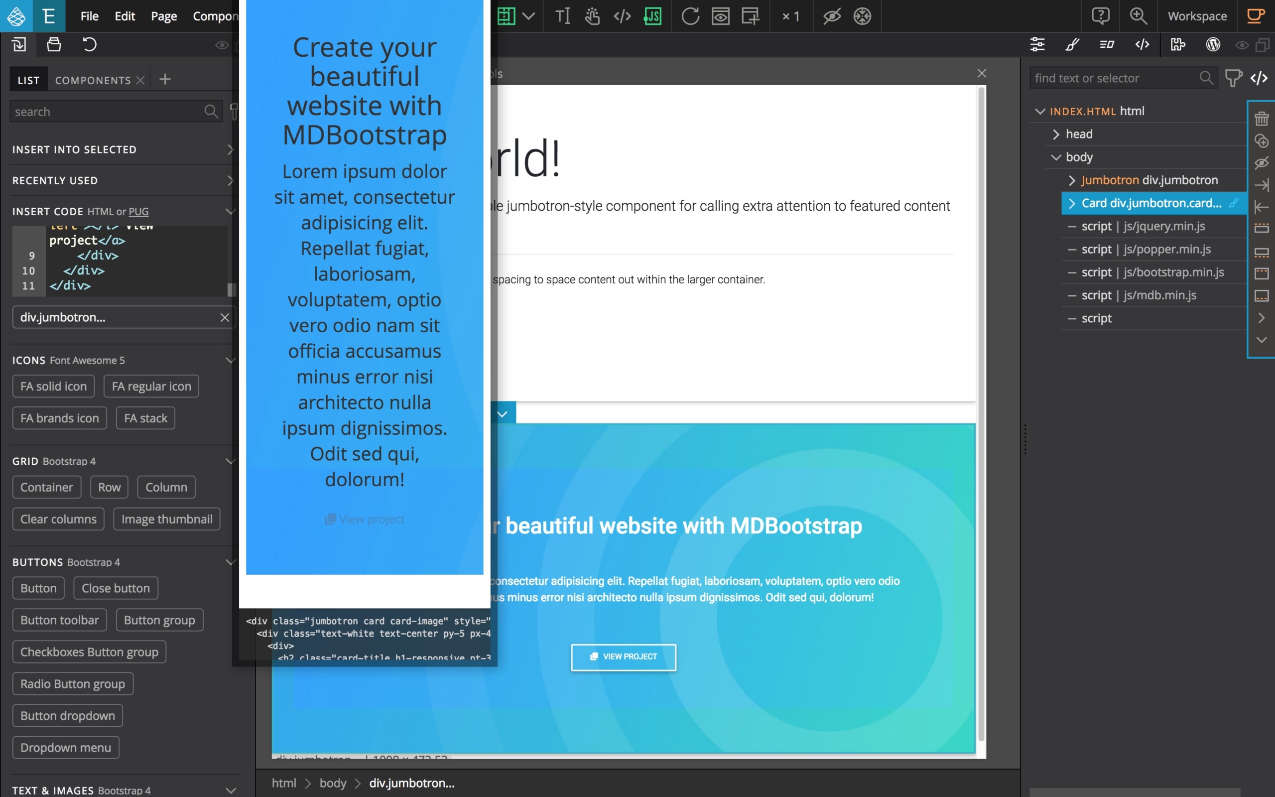
Note: If you move your mouse over the component in the library, you will see a simplified preview of the component.
Pro TIP This way of copy / pasting code snippets with Insert Code is not reserved to MDB code snippets. You can copy / use snippets from any origin.
Customizing the MDB framework using SASS and Pinegrow
This is one of the most important feature with MDB, you have full access to the SASS source files (see the first part of this tutorial) so you can fully customize the components styles and colors.
Here is an interesting read about using SASS in a web project: 7 benefits of using SASS over conventional CSS
To proceed, you will have to edit the code of one of the many SASS includes files available from the STYLESHEETS preview.
The customization options are extremely numerous and it is not the purpose of this tutorial to detail them all but as an example, here is how to change the background color for the PRIMARY elements (buttons and so on).
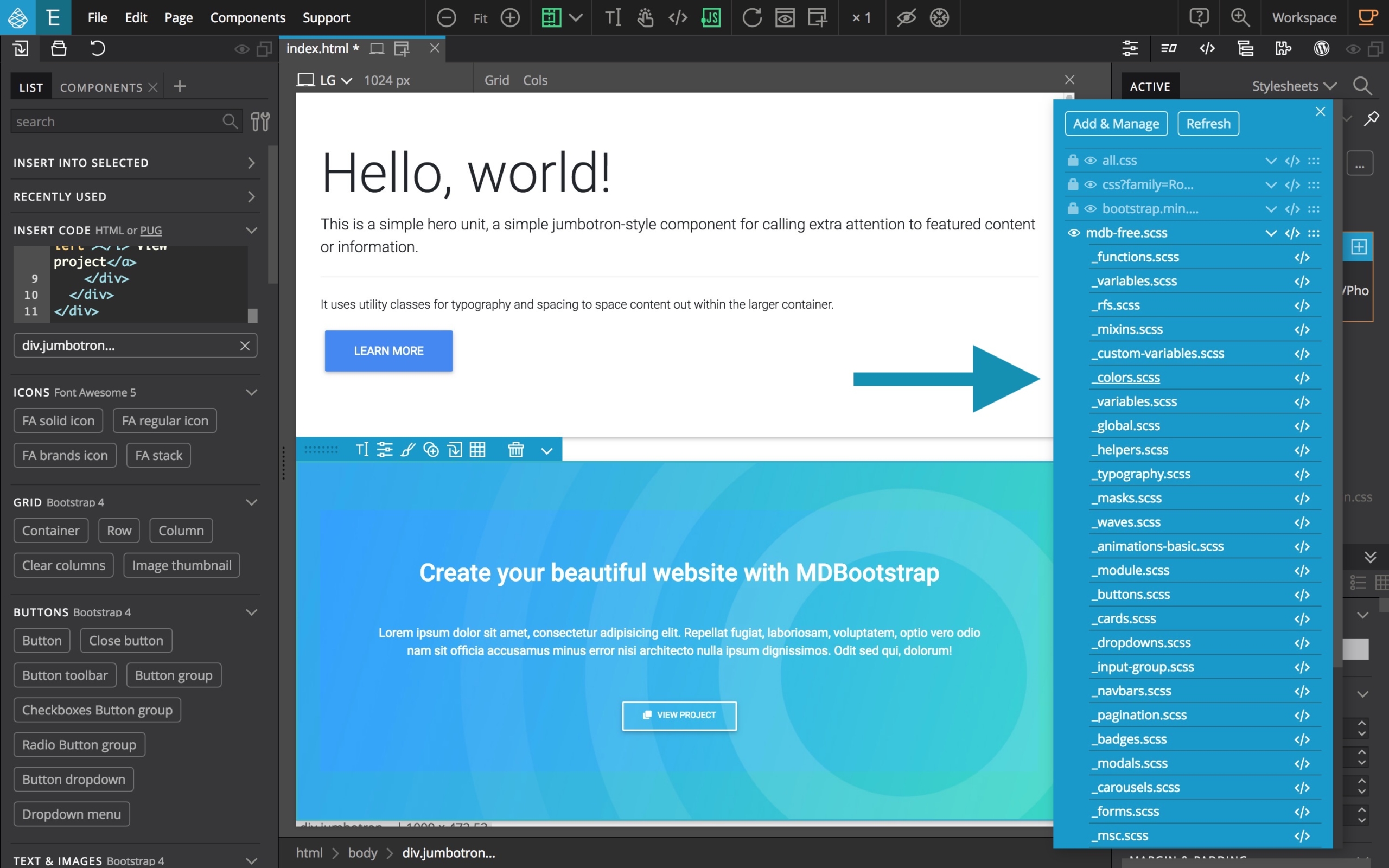
Click to open and edit the _colors.scss file, then search for $primary-color then change it according to your likings.
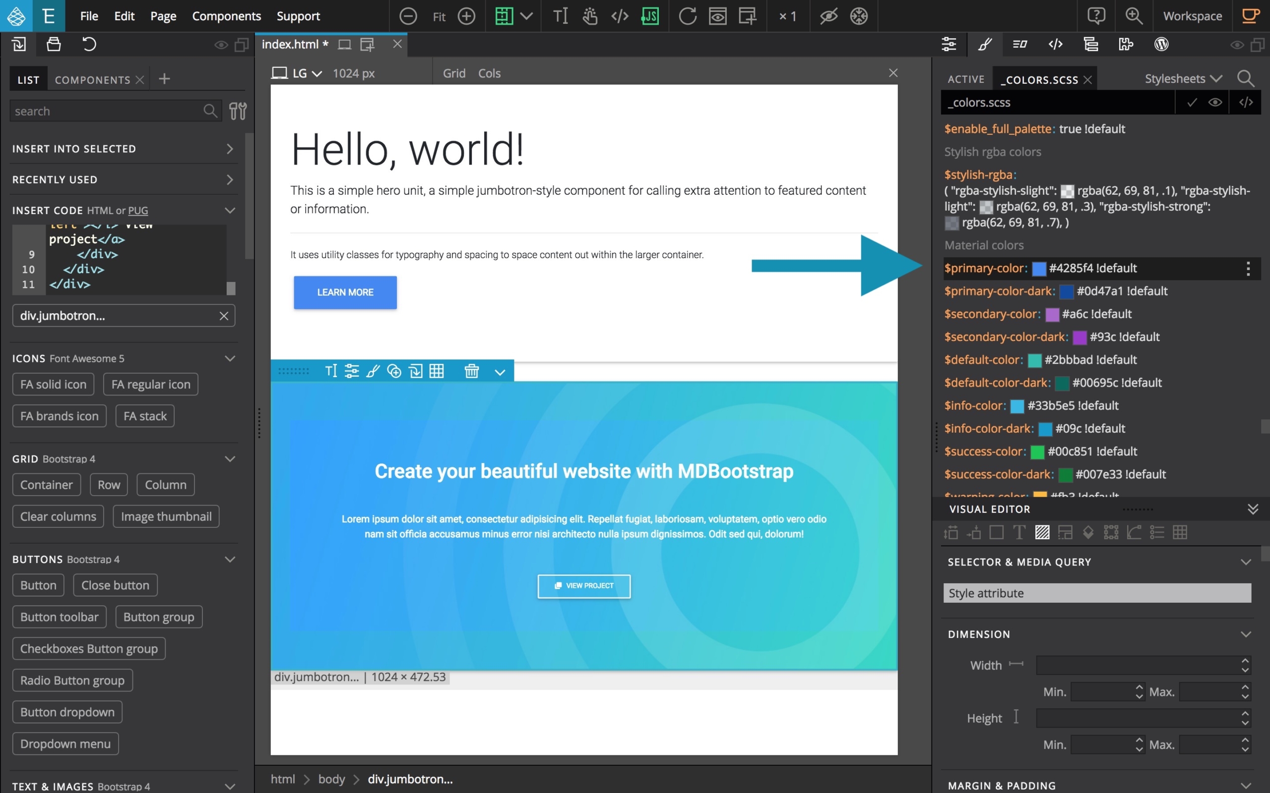
If you have an element using this value visible on screen, the change will be visible immediately.

Of course, this part is a bit more complex as you will have to know “where” and “what” to search”, but with the help of the MDB documentation + the comments available in the SASS source files, you can find your way.
A tip: Use the Active tab of the Style panel to see what SASS variables affect the styling of the selected element. Right-click on the variable and select “Edit variable” to change its value.
Discuss this tutorial
Have questions or comments about this tutorial? Let’s talk about it on our forum.
Get in touch
Would you like to see a particular topic featured in the next tutorial? Let us know in the forum or by email!